Most kitchen advice you read is the polite version. The real designer playbook is quieter and a little ruthless, because it is built around how a kitchen actually gets used at 7 a.m. with one hand full. The pretty stuff comes last.
These are the moves I lean on when a client wants their kitchen to feel considered without a full gut job. Some cost almost nothing. A few are worth real money. I will be honest about which is which, and where designers quietly cut corners that you can too.
What Designers Actually Do
The biggest gains are invisible: pull-outs and toe-kick drawers that swallow clutter, plus a roughly 70-30 split of closed to open storage so the room stays calm. Light colors and layered lighting do the heavy lifting in small kitchens, and they cost far less than a renovation.
After that it is texture and contrast. Stuff is rarely the answer. One bold backsplash, two mixed metals, a few real materials aging in honest ways. Spend on the surfaces your hands touch daily, and keep the decorative layer small enough that you can change it on a Saturday.
Maximize Space With Hidden Storage

The first thing a designer does is find space nobody else sees. Toe-kick drawers under your base cabinets reclaim a band of dead air about four inches tall and the full width of the run. That is enough for sheet pans, platters, or a pet bowl set that you want out from underfoot. Pull-outs turn a deep, useless lower cabinet into a pantry you can actually read at a glance.
Years of redoing tired kitchens taught me that people rarely need more cabinets. They need the cabinets they have to give up their hidden volume. A lazy Susan in a blind corner, a pull-out trash and recycling bay, a vertical tray divider beside the oven: each one empties a counter.
- Toe-kick drawers ($150-300 each installed) for flat, rarely-used items
- Full-extension pull-out shelves so the back of the cabinet stops hiding things
- A narrow base pull-out beside the range for oils and spices within reach
Balance Open and Closed Storage

Open shelving photographs well and then fills with clutter in a month. The designer fix is a ratio. Keep some, hide more. Aim for roughly 70 percent closed storage to 30 percent open, so the messy majority of your kitchen has a door to hide behind while a small, curated slice stays on show.
Put the open section where you can keep it honest, usually a short run near the sink or coffee zone that you reset daily. Everything bulky, mismatched, or ugly-but-necessary goes behind cabinet doors. I have torn out enough all-open kitchens to know the homeowner almost always asks for doors back within two years.
- Keep daily dishes on open shelves so the rotation itself stays tidy
- Hide small appliances in an appliance garage or deep drawer
- Use lidded baskets up high for the things you reach for twice a year
💡The 70-30 storage rule
Keep about 70 percent of your storage closed and 30 percent open. The closed majority hides the daily mess; the small open slice gives you the styled, designer look without the upkeep of an all-open kitchen.
Light Colors That Make a Kitchen Feel Bigger

Color is the cheapest square-footage trick in the book. Soft whites, warm grays, and pale greige bounce daylight around a cramped galley and blur the line where the wall meets the cabinet, which tricks the eye into reading the room as larger. A small kitchen painted one continuous light tone always feels bigger than the same room broken into contrasting blocks.
The move designers actually use is going tonal: cabinets, walls, and trim within a shade or two of each other. It quiets the visual noise so your eye glides instead of stopping at every edge. For a deeper dive on choosing a forgiving cabinet color, the principles behind a timeless kitchen palette apply straight across.
If you crave color, save it for one wall or the island. A pale kitchen with a single grounded element stays airy and still has a pulse. Paint is also the lowest-risk experiment you own, since a wrong choice costs a weekend and $50 in supplies, not a contractor.
Lighting That Combines Function and Style

One ceiling fixture is why so many kitchens feel flat after dark. I tell every client to fix the task layer first, then build up. Designers light in three layers, and the difference between a builder kitchen and a finished one is usually right here.
- Task lighting first: under-cabinet LED strips ($20-60 a run) so you stop chopping in your own shadow
- Ambient layer next: a dimmable ceiling source for overall glow, always backed by the other two layers
- Accent layer last: pendants over the island or a lit glass cabinet for warmth and depth
- Put everything on dimmers; one switch upgrade changes the mood of the whole room at night
The lighting belief that flattens most kitchens:
❌ Myth: One bright ceiling light is enough
✅ Reality: A single overhead source casts shadows on your work surfaces. You need task, ambient, and accent layers to actually see and to set a mood.
❌ Myth: Recessed cans alone make a kitchen feel finished
✅ Reality: Cans give flat, even light. Adding under-cabinet strips and a pendant or two is what gives the room depth after dark.
Mirrors and Reflective Surfaces to Brighten

This is the trick designers borrow from dark restaurants. A reflective surface doubles whatever light you already have, which is a gift in a kitchen with one small window. A mirrored or high-gloss backsplash throws daylight back across the counters and makes the far corners feel less like a cave.
Bounce Light, Do Not Add Glare
You do not need an actual mirror to get there. Polished nickel hardware, a glossy tile, a stainless backsplash behind the range, even a glass-front cabinet all bounce light in smaller doses. Layer a few and the room gains a quiet brightness that paint alone cannot buy.
One caution from experience: high gloss shows every fingerprint and water spot. Use it where splatter is low, and keep a microfiber cloth in the drawer.
Mix Materials for Depth

A kitchen built from one material falls flat, which is why showrooms feel a little dead. Depth comes from contrast you can feel: warm wood against cool stone, a matte counter under glossy tile, woven texture beside smooth painted cabinets. Three materials, thoughtfully paired, give a room more character than any single expensive finish.
The rule that keeps it from turning into chaos is simple. Pick one material to dominate, let a second support, and use the third only as an accent. On a recent job we ran painted cabinets as the lead, a honed stone counter as support, and a single walnut shelf as the spark. That is the whole recipe.
Natural materials win here because they age with grace. A wood edge that softens, a stone that takes on patina, a brass pull that mellows: these give the eye somewhere honest to land.
How designers pair materials without it turning busy:
1Choose the lead
Pick one material to cover the most surface, usually cabinets or counters, and let it set the tone.
2Add the support
Bring in a second material with a different temperature: warm wood against cool stone, or matte against gloss.
3Spark with an accent
Use a third material in one small dose, like a single shelf or the hardware, so it reads as intentional.
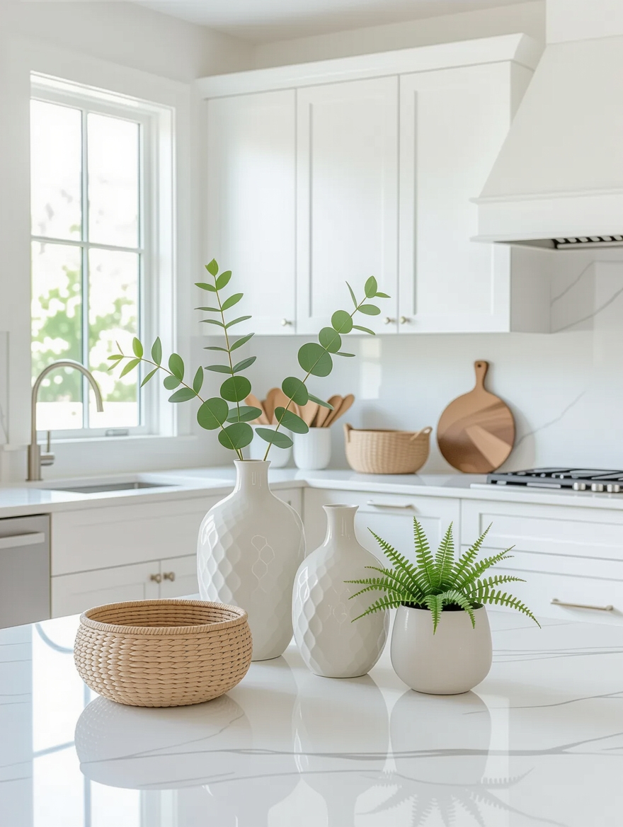
Layer Textures for a Cozy Kitchen

Texture is what separates a warm kitchen from a sterile one, and it costs almost nothing. Hard, smooth surfaces dominate most kitchens by default, so the job is adding softness back: a linen runner, a woven stool seat, a nubby rug underfoot. These small tactile contrasts give the room something to hold onto.
Designers layer texture in the spots your eye rests, then stop. A little goes a long way, and too many competing textures start to feel busy. The question clients ask me most is why a finished kitchen feels cozy and theirs does not, and the answer is almost always soft texture. Rarely a gadget.
- A flat-weave cotton rug by the sink for softness that washes easily
- Natural-fiber baskets and a wooden board left out to break up hard edges
- Linen or waffle towels in place of stiff terry for a softer look that still works
A Bold Backsplash for Instant Impact

When a budget only stretches to one statement, designers spend it on the backsplash. It sits at eye level, it is a contained area, and it changes the entire mood of the room for a few hundred dollars. Here is how to make it carry the room.
- Pick the backsplash first, then pull cabinet and counter colors from it, not the reverse
- Keep the rest of the room quiet so the bold tile has room to breathe
- Run it to the ceiling behind the range for a built-in, intentional look
- Budget $15-40 per square foot for a handmade or patterned tile that earns the spotlight
Express Your Style With Hardware

Hardware is where designers let a client’s personality show without committing the whole room to it. It is small, it is swappable, and it carries a surprising amount of the kitchen’s character. Sleek bar pulls lean modern, cup pulls and round knobs lean classic, and the finish you choose sets the temperature of the space.
Buy One, Then Buy the Rest
My honest advice is to buy one sample before you buy thirty. Hold it against your cabinet in real daylight, grip it, open a drawer with it. Hardware is the one thing you touch a hundred times a day, so a piece that feels cheap in the hand will bug you forever.
Mixing two finishes is fine and often better, as long as one clearly leads. A warm brass paired with a matte black gives a kitchen more depth than one uniform finish ever could.
Beautiful, Durable Countertops

Countertops are where beauty meets daily abuse, so designers choose them with the lifestyle in mind, not just the mood board. A family that cooks hard wants something forgiving. A careful couple can chase the dramatic veining that stains if you sneeze near it. I tell clients to be honest about which cook they are before falling for a slab.
Quartz is the low-drama workhorse, non-porous and nearly maintenance-free. Granite handles heat and knives and seals once a year. Butcher block brings warmth and sands back to new, while marble rewards people who treat patina as character. Match the surface to your patience, and you will love it for a decade.
- Quartz ($50-100/sq ft): non-porous, no sealing, best for busy households
- Granite ($40-70/sq ft): heat-proof and tough, a quick yearly seal
- Butcher block ($30-60/sq ft): warm and repairable, oil it a few times a year
Maintenance & Care
The secret designers really keep is that a finished kitchen stays finished only if it is easy to maintain. Every choice above has an upkeep cost, and the smart move is matching that cost to your actual habits. High-gloss surfaces and open shelving look beautiful in photos and demand constant resetting in real life, so choose them only where you will keep up.
A simple rhythm holds it together: wipe and reset counters nightly, seal stone each spring, oil wood counters when water stops beading, and rotate the small open display so it stays fresh. None of it takes long. If you want a lower-effort path overall, lean toward closed storage and a clutter-free counter habit, and borrow the spend-where-it-shows logic from a budget kitchen refresh. For walls that carry character with zero upkeep, paint does the work.
Kitchen Decor Questions Designers Get Asked
?What is the one thing designers spend the most on in a kitchen?
Storage you cannot see. Pull-outs, toe-kick drawers, and smart organizers beat extra cabinets every time, because they empty your counters, and clear counters are what make a kitchen feel high-end.
?How much open shelving should a kitchen actually have?
Less than the photos suggest. A 70-30 split of closed to open storage keeps the room calm. Reserve the open section for a short, daily-use run you can reset without thinking.
?What is the cheapest way to make a kitchen look designed?
Paint plus lighting. A tonal light palette and three layers of light, all on dimmers, transform a room for well under a few hundred dollars and no demolition.
?Is it okay to mix metal finishes in a kitchen?
Yes, and it usually looks richer than matching everything. Let one finish dominate the big pieces and use a second as an accent. Keep it to two metals so the mix stays intentional.
Steal the Playbook, Skip the Markup
None of these are really secrets so much as priorities. Designers spend on hidden storage, smart lighting, and the surfaces you touch, then let cheap moves like paint, texture, and one bold backsplash carry the personality. Get that order right and a kitchen feels considered without a designer invoice.
Pick the one corner that bugs you most and start there this week. Bookmark this list so the next time you have a free Saturday, you already know which move gives you the biggest return for the smallest spend.