Years ago I hung a single oversized lemon print on a blank kitchen wall for a client who swore art belonged in the living room. Every guest at her next dinner walked straight to it. That is the quiet power of kitchen wall art: the room is where people gather with a drink, so whatever hangs there gets read closely.
The pieces below are the ones that earn that second look. Some are cheap printables, some are personal, and a couple are conversation starters by design. I will tell you what works on a real kitchen wall, where the grease and steam live, and how to hang it so it looks deliberate.
The Pieces That Get Noticed
- Go big or go gallery: one oversized print looks intentional, and a tight cluster of small frames feels collected. A scatter of mismatched sizes just turns into clutter.
- Make it personal: framed family recipe cards and custom chalkboards pull guests in faster than any store print, because they invite a question.
- Mind the conditions: grease and steam fade cheap prints fast, so frame anything near the range under glass and keep raw canvas away from the stove.
Food-Themed Culinary Wall Prints
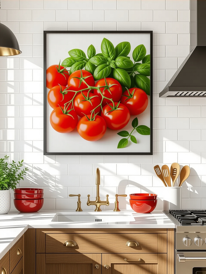
Food prints are the safest crowd-pleaser in a kitchen, because the subject matter belongs there and the colors tend to be warm. A single large print of a lemon, a fig, or a stack of tomatoes pulls the eye and gives a plain wall a reason to exist. The trick is scale. One print at 24 by 36 inches carries a wall that a dozen tiny frames would only clutter.
I steer clients toward one hero piece over a busy collage, especially in a small kitchen where the wall space is already broken up by cabinets and outlets. Pick a color already living in the room, a pull, a tea towel, the backsplash, and echo it in the art so the piece feels planted instead of stuck on.
Budget-wise these are friendly. A quality giclee print runs $25 to $80, and a simple wood frame from the craft store finishes it without competing. Keep the matting generous; that band of white around the image is what makes a cheap print look like a gallery buy.
Witty Cooking Quotes That Spark Talk
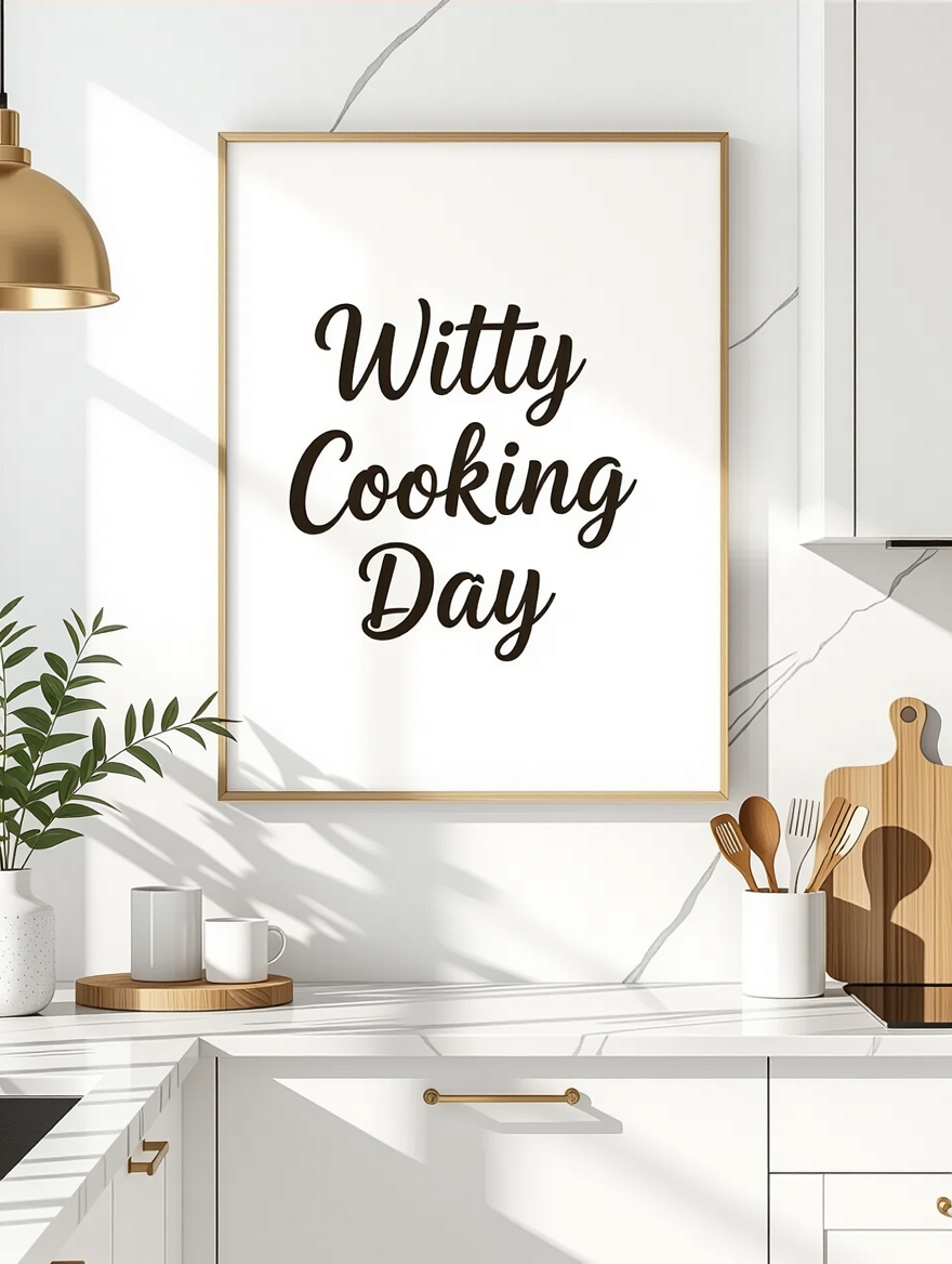
A clever line on the wall does something a landscape cannot: it makes people smile and say it out loud. That is free entertainment at a dinner party. The key is restraint, since one good quote lands and three turn the kitchen into a gift shop.
- Choose a quote that fits your humor, so it sounds like you and not a magnet rack
- Keep the type large and high-contrast; if a guest squints, it has already failed
- Hang it where people pause, by the coffee station or the spot they lean while you cook
📋Before you hang a quote piece
- ✓Does the line actually sound like you, or like a generic magnet?
- ✓Can a guest read it from across the room without squinting?
- ✓Is it going where people naturally pause, not on a random blank wall?
Vintage Signs for a Nostalgic Kitchen
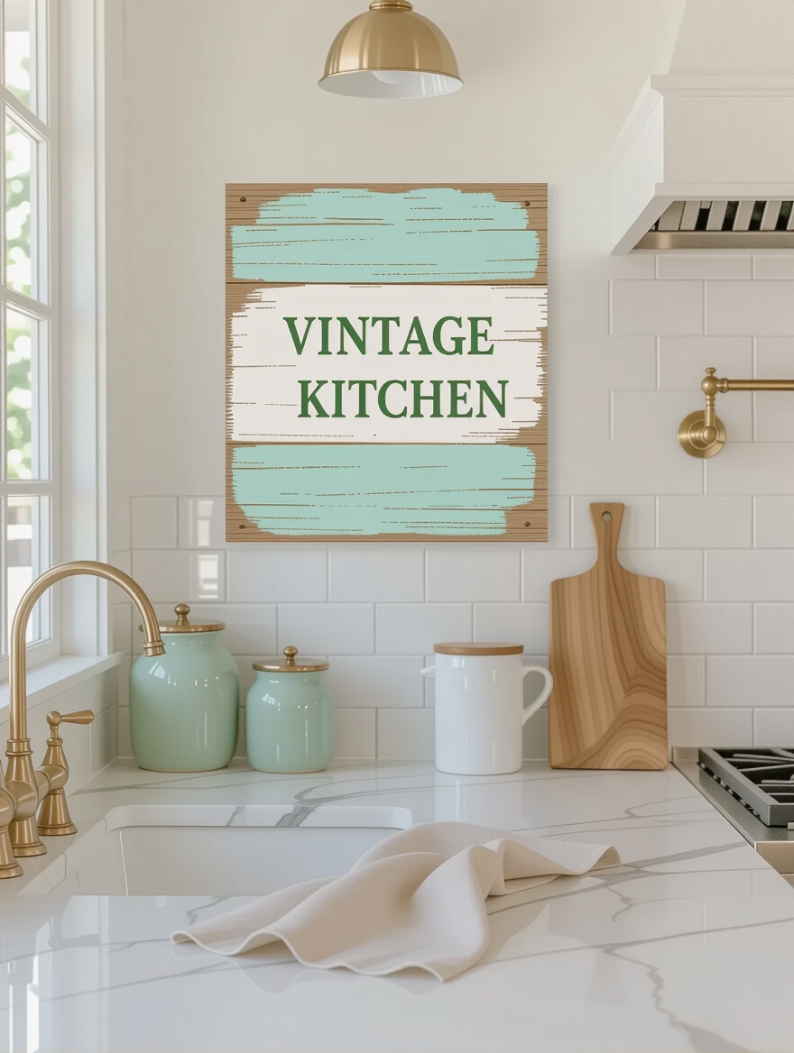
Vintage signs carry a story before anyone reads a word, and that nostalgia is exactly what makes a kitchen feel settled instead of staged. A weathered enamel sign or a reproduction market board adds age to a new build that otherwise has none. Guests respond to it because it feels found, like it has been there for years.
The honest catch is the line between charming and kitschy. One real-feeling piece grounds a wall; a whole collection of cute slogans tips into theme-restaurant. Hunt flea markets and estate sales for the genuine article, and let a single sign do the talking against quiet walls and a timeless palette.
- Enamel and tin signs for authentic age and a little reflective shine
- Reproduction boards if you want the look for $15 to $40 without the hunt
- One sign per wall, surrounded by space, so it stays a focal point
Botanical Prints of Herbs and Veg
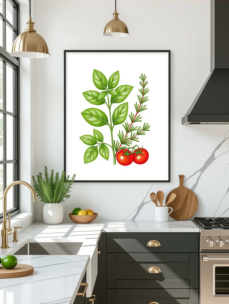
Botanical prints are the dependable choice when you want color without commitment. Detailed illustrations of basil, rosemary, or heirloom tomatoes bring the garden indoors and stay calm enough to live with for years. They suit almost any style, which is why designers reach for them when a client cannot decide on a direction.
A set of three matching prints in identical frames is the move here. Lined up in a row or stacked in a column, they create a tidy grid that feels intentional and costs very little. Free botanical downloads are everywhere online, so the whole project can come together for the price of three frames.
- Hang a trio in matching frames for an instant, orderly gallery
- Keep two to three inches of even spacing between frames so the grid stays crisp
- Print on matte paper to cut glare from kitchen lighting and windows
ℹ️Good to Know
Real plants and paper art do not love the same spot. Kitchen humidity and grease near the range can warp unframed botanical prints over time, so glass them or hang them on a drier wall away from the cooktop.
Customizable Chalkboard Wall Art
A chalkboard is the rare piece of wall art that earns its keep daily. It holds the grocery list, the week’s menu, or a doodle from a kid, and it changes whenever you feel like it. Guests gravitate to it because it shows the kitchen is lived in and a little playful.
You can buy a framed chalkboard or make one for almost nothing with chalkboard paint and a thrifted frame, which runs about $15 in supplies. Season a new board first by rubbing the side of a chalk stick over the whole surface and wiping it down, or your first message will ghost forever.
For a cleaner look, chalk markers give crisp lettering that survives bumps but still wipes off with a damp cloth. I keep one in the junk drawer of every kitchen I style, because a tidy board says you care and a smeared one says you stopped.
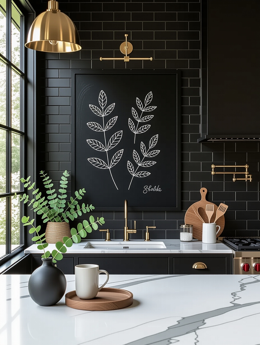
Minimalist Line Art for Modern Kitchens
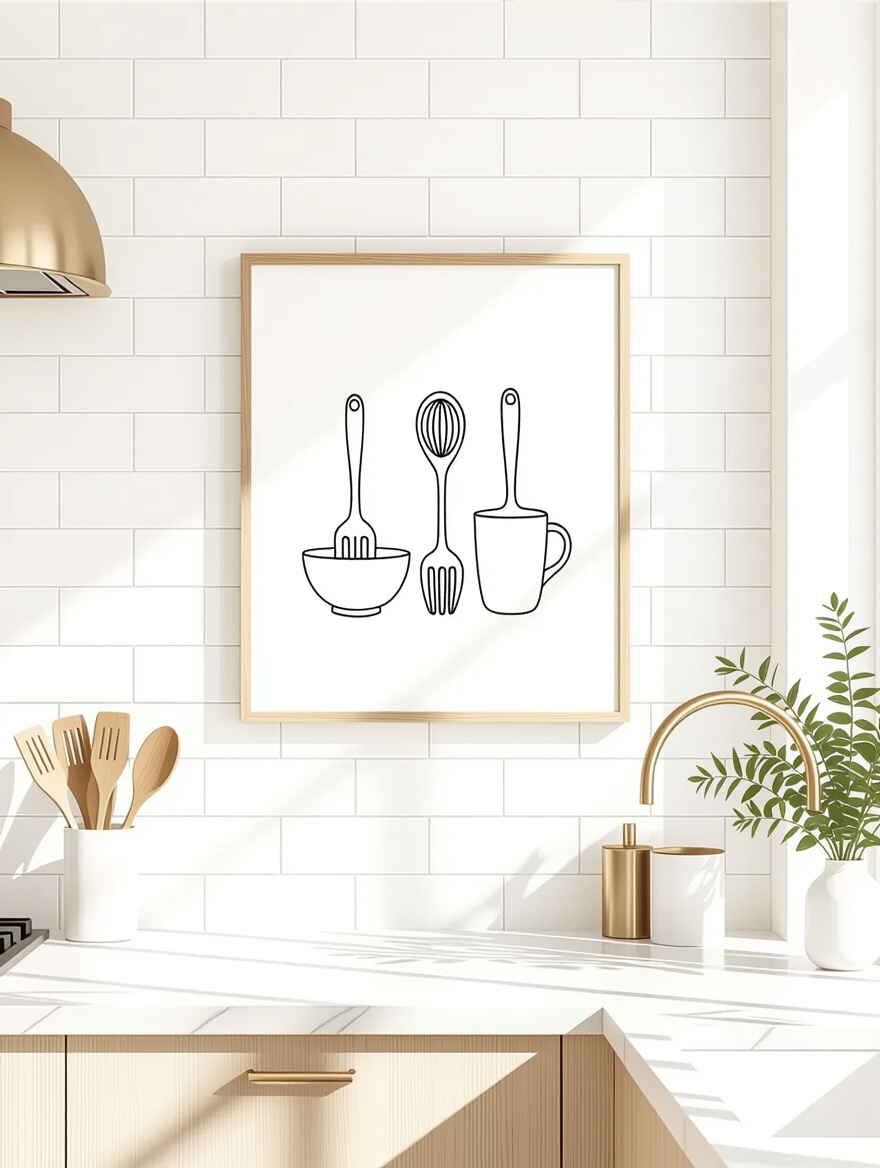
When a kitchen is already busy with pattern and hardware, line art gives the eye a place to rest. A single continuous-line face or a simple still life in black on cream brings a quiet, modern note without adding visual noise. It is the piece I suggest for clients who find food prints too literal.
The look depends on framing more than the art itself. A thin black or natural-wood frame with a wide mat keeps it sharp and gallery-like, while a chunky ornate frame fights the simplicity. Because the art is so spare, you can find lovely options as free or cheap printables and spend your money on good frames instead.
👍Why minimalist line art works
- +Calms a busy kitchen and never competes with pattern
- +Cheap to source as printables, so money goes to framing
- +Suits modern and transitional kitchens without dating
👎Where it falls short
- –Can feel cold or sparse in a warm, rustic room
- –Lives or dies by good framing and a generous mat
- –Too subtle to carry a large empty wall on its own
Colorful Abstract Kitchen Wall Art
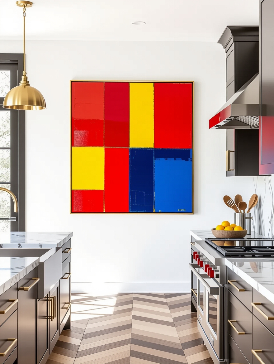
Abstract art is how you bring real color into a neutral kitchen without painting the cabinets. Bold shapes and splashes give a flat wall energy and become an easy talking point, since everyone has an opinion about what they see in it. For a kitchen that plays it safe everywhere else, this is the spot to be brave.
Tie One Color to the Room
Pull at least one color in the piece from something already in the room so it feels connected rather than random. A green that echoes your plants or a rust that picks up a stoneware bowl ties the whole wall together. That single thread of repetition is what separates a designer look from a poster sale.
Large abstracts can get expensive fast, but you have cheaper routes. Stretched canvas prints, peel-and-stick murals, or a framed scarf all deliver the effect, and a confident DIY pour on canvas can cost under $30 in paint.
Rustic Farmhouse Wall Plaques
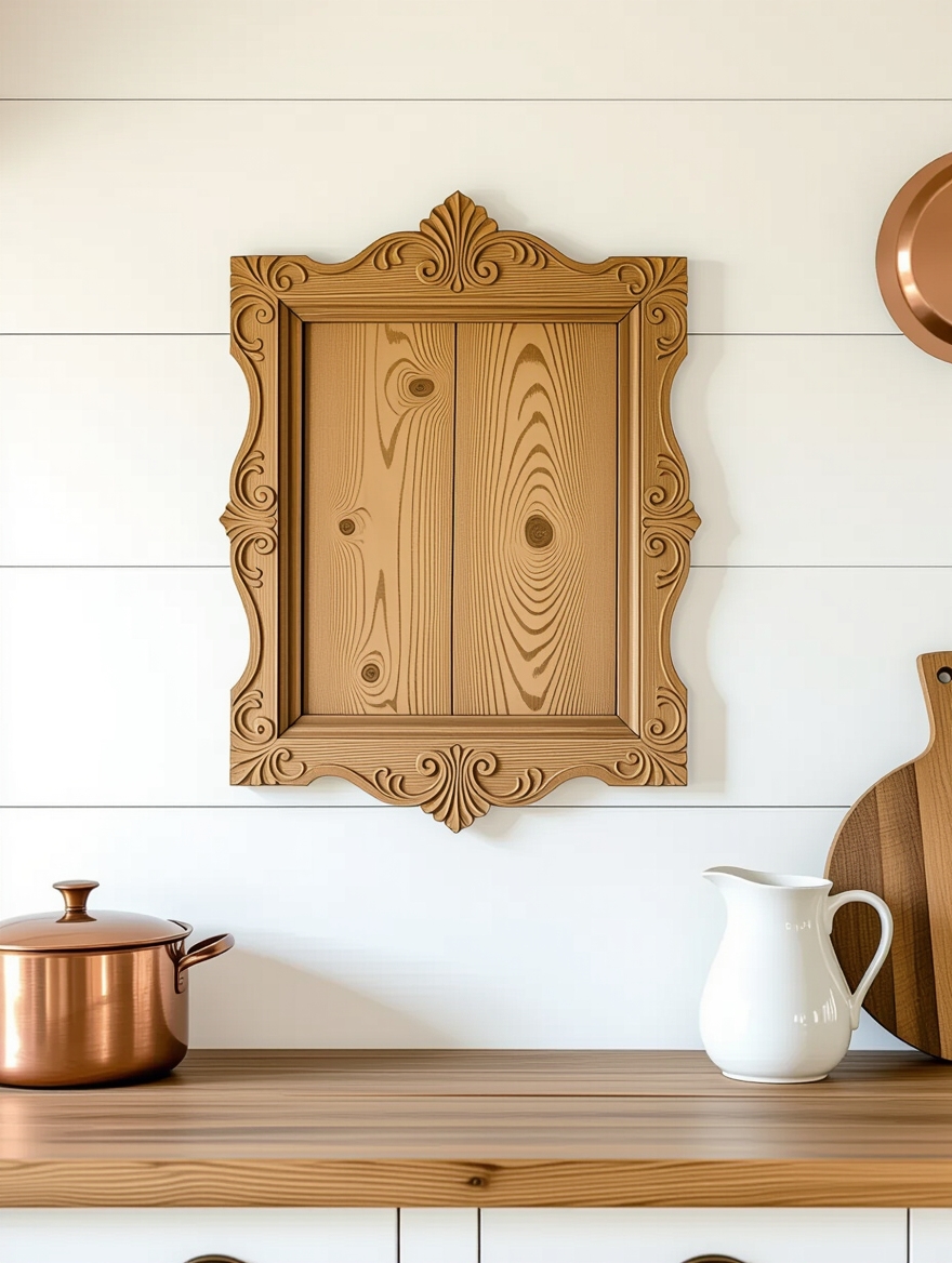
Rustic plaques bring something most prints cannot: actual texture. Distressed wood, hammered metal, and a little dimensional depth catch the light and warm up a wall that paint left flat. In a farmhouse or transitional kitchen, one good plaque does the work of a whole gallery.
Let Texture Do the Talking
The pieces that hold up have real materials and a light touch with the message. A reclaimed-wood board with a simple word or a nature motif feels grounded, while a glittered mass-produced sign cheapens the wall it hangs on. Texture is the point, so let your hand confirm it before you buy.
These pair naturally with other farmhouse kitchen details, and they forgive an imperfect wall, since a rustic piece is supposed to look a little worn. Hang it on the wall guests face when they walk in for the warmest first impression.
Stylish Recipe Typography for the Kitchen
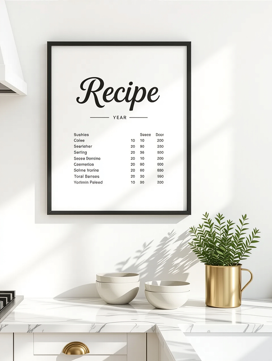
Recipe posters turn something you love to make into wall decor, and the personal angle is what gives them their pull. A grandmother’s cookie recipe set in clean type, or a favorite cocktail laid out as a poster, works as both art and story. Guests lean in to read it, then ask about it.
- Use a real family recipe for typography that means something, not a generic one
- Keep the layout clean with one or two fonts so it stays modern, not crowded
- Frame under glass near cooking zones so splatter wipes off the front
Cozy Illustrated Coffee and Tea Art

Illustrated coffee and tea prints are made for a specific job: marking out a cozy corner. Hung above a coffee station or a kettle nook, warm beverage art tells everyone this little zone is for slowing down. The warm browns and creams in these pieces do half the cozying on their own, and they pair beautifully with a coffee bar setup that keeps the counter calm.
- Cluster two or three small prints above the coffee maker to define the zone
- Lean toward vintage-style illustrations for warmth over stark modern graphics
- Add a small shelf below for mugs so the art and the function read as one corner
How to Choose, Frame, and Hang It
Whatever you pick, the kitchen will test it. Grease, steam, and afternoon sun all fade and warp art faster than a hallway ever would. So glass matters: frame anything within a few feet of the range under glass you can wipe, and keep raw canvas or unframed paper for walls away from the stove. Matte prints beat glossy here, since they shrug off the glare from overhead lights and windows.
Hanging is where most people slip. Center art at about 57 to 60 inches from the floor, or just above a counter or table with a hand’s width of breathing room, so it relates to the furniture instead of floating. Group small pieces tightly, within two to three inches, so they read as one unit.
For more ways to give plain walls personality, a coat of color behind the art does as much work as the frames, and the same editing logic that powers a designer’s best decor secrets applies on the wall too.
Kitchen Wall Art Questions
?What kind of wall art holds up best in a kitchen?
Framed prints under glass survive grease and steam better than raw canvas or unframed paper, especially near the range. Choose matte prints to cut glare, and keep anything delicate on a wall away from the cooktop where heat and splatter are lowest.
?How big should kitchen wall art be?
Bigger than most people guess. One piece around 24 by 36 inches anchors a wall far better than several small frames. If you prefer small pieces, cluster them tightly into one grouping so they read as a single unit instead of scattered.
?What height should I hang kitchen art?
Center the piece at roughly 57 to 60 inches from the floor, the standard gallery eye line. Above a counter or table, drop it so there is just a hand’s width of space above the surface, which ties the art to the furniture below it.
Hang the One That Sounds Like You
The wall art guests remember is rarely the most expensive piece. It is the one with a story or a wink, sized right and hung with care, that gives them something to talk about while you finish dinner. Personal beats pricey every time in a kitchen.
Start with one wall and one piece you truly like, frame it well, and hang it at the right height. Get that single anchor right, and you can build out from there whenever the mood strikes.