

Deep forest cabinets had their big moment, and plenty of people went all in on them. Light green is the easier love. It brings the same connection to the garden outside without swallowing the daylight, which is exactly why a pale green kitchen feels brighter the second the cabinets go up.
The catch is that light green is not one color but a dozen, and the undertone decides everything. Sage leans gray, mint leans cool, pistachio leans warm, and each one wants different counters and light around it. This is a shade-by-shade tour, so you can find the green that brightens your own corner.
Reading the Undertone Before You Paint
| Shade | Undertone | Brightest with |
|---|---|---|
| Sage, pale olive | Soft gray-green | Warm white walls, brass, wood floors |
| Mint, seafoam | Cool blue-green | Crisp white, chrome, plenty of daylight |
| Pistachio, honeydew | Warm yellow-green | Cream, natural wood, soft brass |
Sage Green for Quiet Elegance

Sage is the light green I recommend to most people first, because it behaves almost like a neutral. The gray in it keeps the color calm. It brightens a kitchen without shouting and pairs with nearly anything you set beside it, from warm woods to cool stone to a simple brass tap. It is the safe-but-lovely choice that suits a first-time green kitchen, and the one people seem to regret the least a few years down the line.
What makes sage brighten a room is the company you give it. Keep the surfaces around it warm and light:
- Pair sage with warm white walls and a pale counter so the green stays soft and the room stays open.
- Add brass or aged-gold hardware for warmth that lifts the gray undertone.
- Bring in wood floors or open shelves so the kitchen feels collected and warm.
Mint Cabinets That Enhance Brightness
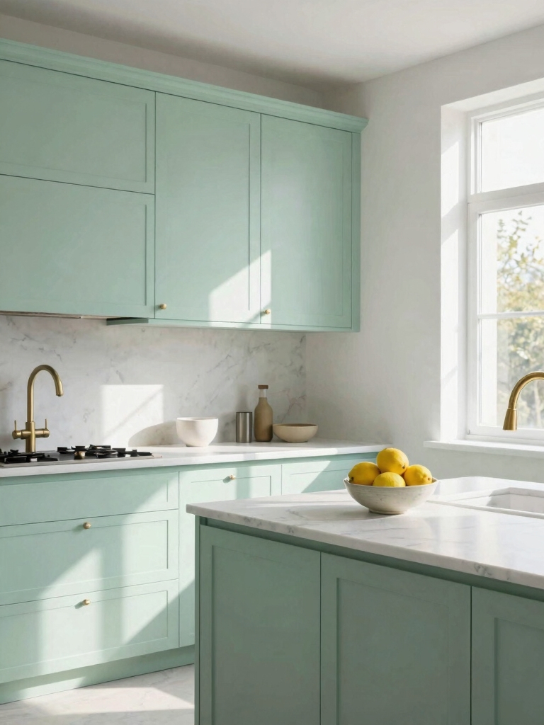
Mint is the cheerful, cool end of light green, and it can make a kitchen feel like a fresh spring morning. Because the undertone is cool and blue-leaning, mint is at its best where there is good daylight to bounce off it. In a dark room it can read a little chilly. So this is a shade I love most in a bright, sunny kitchen, where the morning light pours in and bounces off the doors to fill the whole room with a clean, green-tinged glow. To keep it crisp:
- Pair mint with clean white walls and counters so it stays crisp and clear.
- Choose chrome or polished nickel hardware to echo the cool, clean feel.
- Let in as much daylight as you can, since mint rewards a bright room and sulks in a dim one.
People agonize over which green, but the undertone matters far more than the name on the tin. Hold the sample against your own counter and window before you trust any swatch.
Timeless Pale Olive Kitchens

Pale olive is the grown-up of the light greens, a soft khaki-green that feels earthy and settled. It has more warmth than sage and more depth than mint, which makes it read timeless and grounded. If you want a green that will still feel right in ten years, olive is the one.
Why Olive Ages So Gracefully
It carries warm metals and natural materials beautifully. Brass handles, butcher-block counters, and terracotta or stone floors all bring out the earthiness and keep the kitchen feeling grounded. Against a creamy white wall, pale olive glows softly, and under warm evening lamplight it deepens into something almost amber-green that makes the whole kitchen feel like the cozy heart of the house rather than a place you only pass through.
Because it is a quiet, complex color, olive forgives a busy kitchen. It hides the odd scuff and pairs with the wood and clay tones you probably already own, so it ties a collected room together. The same easy-warmth thinking runs through our kitchen room design guide.
Sophisticated Seafoam Green

Seafoam sits right on the border of green and blue, which gives it a soft, coastal calm. It is a touch cooler than mint and a touch more complex, so it feels considered and grown-up. In the right kitchen it is quietly lovely. The gentle, watery quality brightens a room and reads as calm rather than cute, which is why it suits a grown-up coastal or a soft modern scheme just as happily as a cottage one. Here is how to use it well:
- Lean into the coastal feel with white counters and natural textures like rattan or linen.
- Pick brushed nickel or soft brass hardware to keep the cool tone from feeling clinical.
- Use it on lower cabinets with white uppers if you want the color without committing the whole room.
Heads-Up
Green shifts more than almost any color between daylight and lamplight, and between morning and evening. Never commit from a tiny swatch under the store lights. Paint a sample board, move it around your kitchen for a couple of days, and check it against your actual counter and floor before you order a whole run.
A Pistachio Green Transformation

Pistachio is the warm, yellow-leaning light green, and it is the one that turns a flat kitchen into a happy one. The warmth in it makes a room feel welcoming and sunlit, which is why repainting tired cabinets pistachio can transform the whole mood for the price of a few cans. A quality cabinet paint job runs a few hundred dollars in materials if you do it yourself, and the change is dramatic.
Keep its company warm to let it glow. Cream walls, natural wood, and soft brass all flatter pistachio, while stark bright-white can fight its yellow undertone and make it look greenish-gray. I tell clients to test a sample on the actual doors and live with it for a few days, since the warmth shifts a lot between morning and evening light.
Elegant Fern Green Cabinets
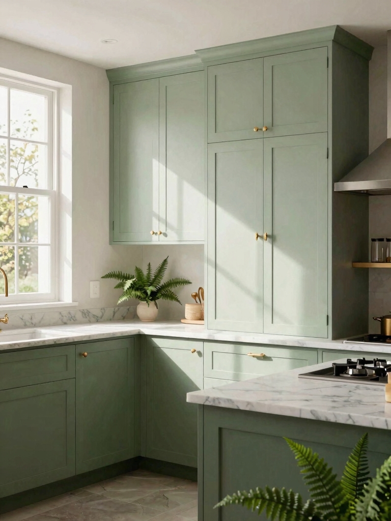
Fern is for the person who loves green but wants a little more presence than sage. It is a soft mid-green with a leafy richness, deep enough to feel like a real color choice yet still light enough to keep a kitchen bright. It is the boldest shade here. Yet it never tips into dark territory. To keep fern from feeling heavy:
- Balance it with light counters and pale walls so the green stays the clear feature.
- Use it on an island or lower cabinets with airy uppers if a full fern kitchen feels like too much.
- Add warm wood and brass so the leafy tone feels natural and easy.
Two worries about green cabinets that keep people stuck on white:
❌ Myth: Green will make my kitchen look dark.
✅ Reality: Light green does the opposite when you pair it with warm white walls and pale counters; the gray-and-pastel shades read as bright as a soft neutral.
❌ Myth: Green is a trend that will date fast.
✅ Reality: The muted, complex shades like sage, olive, and eucalyptus have been used for a century and read timeless; it is the loud, saturated colors that date, not the soft ones.
Vintage Elegance Meets Modern

Light green has a foot in both eras, which is part of its charm. It nods to the painted kitchens of decades past while feeling completely current.
That double life is the whole trick: a soft green Shaker door reads as heritage and as fresh at the same time, so you get to blend the vintage character you love with the modern function you actually need. This is the look I keep coming back to in an older home that wants updating without losing its soul. A few ways to strike the balance:
- Pair Shaker-style green cabinets with modern flat counters for old-meets-new ease.
- Mix a vintage-look faucet or latch hardware with clean, current appliances.
- Add a piece of patterned tile, which our kitchen tile guide sizes up for character.
Honeydew, a Versatile Neutral

Honeydew is the barely-there light green, a whisper of color that acts almost like a warm off-white. If you want the freshness of green without a bold statement, this is your shade. It brightens a kitchen like a soft neutral while adding just enough life to keep white from feeling sterile. Think of it as the green you choose when you are not sure you want green at all. It is the gentlest way in.
Its near-neutral nature makes it the most flexible green here. A few reasons it works almost anywhere:
- It pairs with warm and cool metals alike, so your hardware choice stays open.
- It suits small kitchens, since the pale tone keeps a tight room feeling airy.
- It is forgiving with counters, working with white, wood, and pale stone without a fuss.
Eucalyptus Cabinets Built to Last

Eucalyptus is a silvery, gray-green that brings a soft, slightly muted calm to a kitchen. Its grayed quality is also practical, since a muted tone hides daily life better than a pure, clean color. That makes it a smart pick for a busy family kitchen that takes knocks.
Sticky fingerprints and the odd splash of pasta sauce simply disappear into the grayed tone instead of standing out the way they would on a clean, bright color. It is the quiet workhorse of the greens. Here is how to get the most from it:
- Choose a durable, washable cabinet finish in eucalyptus so the doors take wiping for years.
- Pair it with stone or quartz counters that share its cool gray for a calm, hardwearing scheme.
- Keep the storage smart behind those doors, the kind our modular cabinet ideas plans inch by inch.
Embracing Wear With Elegance

The part nobody mentions in the showroom is this: painted cabinets show wear, and light green is no exception. The good news is that, chosen well, green wears with grace rather than looking shabby, gathering the soft patina that gives a kitchen character over the years. A few habits keep it looking intentional:
- Pick a tough, satin or semi-gloss finish that wipes clean and resists chips at the handles.
- Keep a small jar of the touch-up paint so a five-minute fix handles the inevitable knocks.
- Lean into the lived character on a vintage-leaning green, where a little softening only adds charm.
Find the Green That Brightens Your Corner
What I love about light green is how personal the choice gets once you start looking closely. The right shade depends on your light, your counters, and the mood you want, so the sage that calms one kitchen might fall flat in another that wants the warmth of pistachio. There is a green here for almost every corner, and finding yours is half the fun.
Start with your undertone and your daylight, test a real sample on the actual doors, and let the room tell you which green it wants. Get that right and light green cabinets will brighten your kitchen for years, gaining a little character with every passing one.
More Looks We Love


