
Stand in a kitchen that flows and you feel it before you can name it: your eye glides from the cabinets to the counter to the metals without a single jarring stop. The colors and materials are talking to each other. That ease is the payoff of pairings chosen to share an undertone or a mood.
Below are the pairings that reliably sing together, with a note on what ties each one, the kitchen it suits, and the small thing that trips people up. Borrow a whole combo, or take the underlying logic and build a palette of your own.
What Makes a Combo Actually Flow
What makes colors flow together in a kitchen? Shared undertone and a clear hierarchy. Pick one dominant color, one supporting, and one accent, and keep their warmth or coolness consistent so nothing fights.
How many colors and materials should I use? Aim for three of each at most: a main, a secondary, and an accent. More than that and the eye loses the thread and the room feels busy.
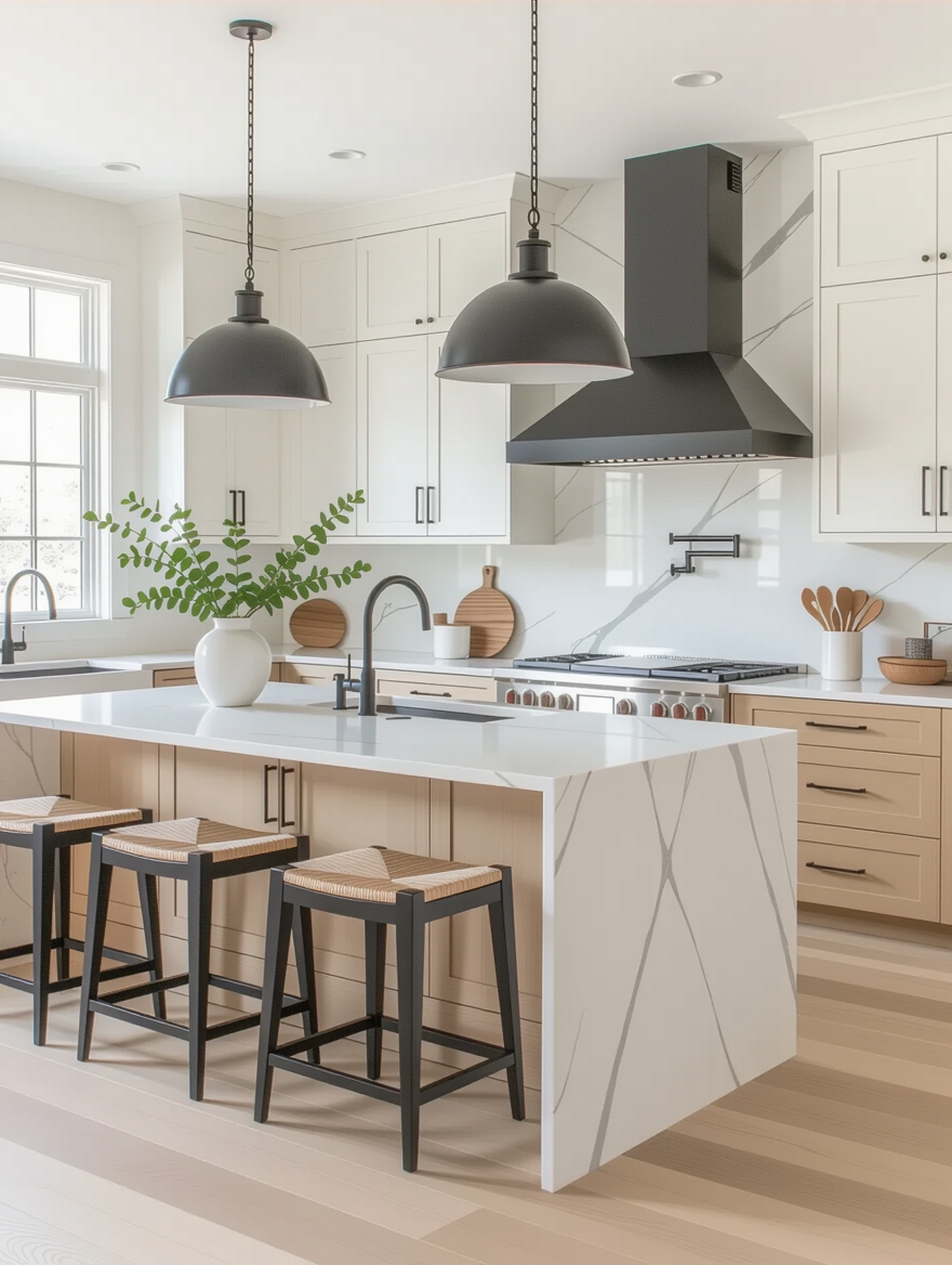
What is the easiest combo to get right? A warm neutral plus natural wood plus one metal. It is forgiving, flows almost automatically, and suits nearly any home.
Timeless Black-and-White Combos

Black and white works because the contrast itself is the design. Crisp white cabinets or walls against black counters, lower cabinets, or a checkerboard floor create a graphic, confident look that has stayed current for a century. I reach for this combo when a kitchen needs backbone. There is no undertone to clash, just light against dark.
What ties it together is a third, softening element so the scheme does not feel stark. A warm wood stool, a brass faucet, or a marble vein with grey movement bridges the two extremes and keeps the kitchen from reading like a chessboard. The bridge is what turns contrast into flow.
It suits a kitchen with good light and a homeowner who likes a tailored look. The honest caveat is that black shows every smudge, so matte black hides fingerprints better than gloss, as our black-cabinet ideas explore.
Cozy Elegance: Warm Wood and Cream

For a kitchen that feels like a hug, warm wood paired with cream or soft white comes together almost on its own. The shared warmth in both, honeyed timber and buttery cream, means they melt together into a calm, inviting room. It is the most forgiving pairing here.
- Pair honey or white-oak cabinets with creamy walls and counters for a soft, unified glow
- Keep the metals warm too, brass or aged bronze, so nothing breaks the cozy mood
- Add a natural-fiber rug or woven shade to deepen the warmth without adding a new color
Heads-Up
Undertone is where most combos quietly fail. A grey that looks neutral on its own can flash blue or purple beside a warm stone, and a white can read cold against cream cabinets. Always check your colors and materials together, in your own light, before you buy the permanent ones.
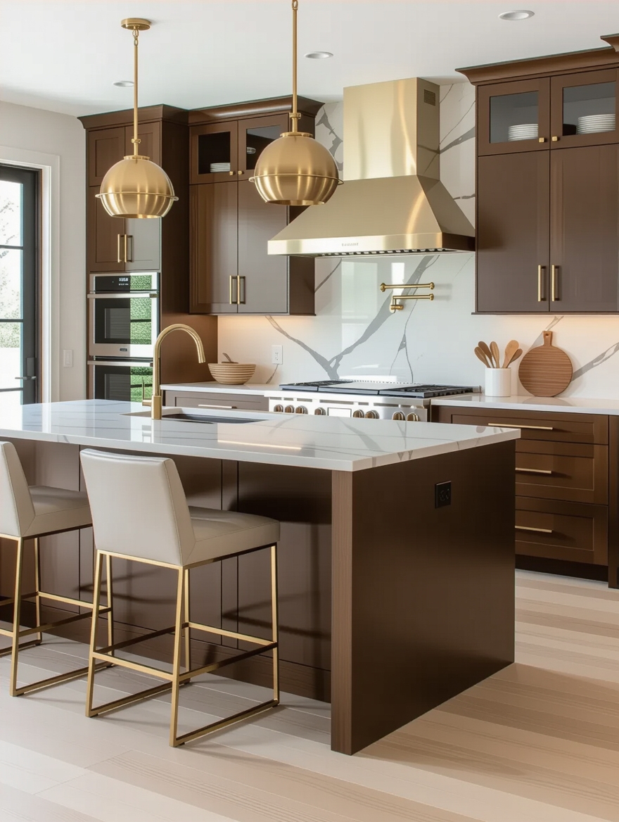
Navy Blue and Brass

Navy and brass sings because the cool blue and warm gold balance each other. Deep navy cabinets feel grounded and rich. Brass hardware, lighting, or a faucet warms them up so the scheme stays inviting. I love this pairing for a kitchen that wants quiet richness. It is a look that feels both classic and current.
Let navy be the anchor and brass the jewelry, used sparingly enough to stay special. Too much brass tips into flashy, so keep it to the hardware and one fixture. White or pale counters keep the combo from going heavy, and our navy cabinet ideas show how to balance it.
Calming Grey and Natural Stone

Grey paired with natural stone earns its place through quiet sophistication. Soft greige or dove-grey cabinets sit beautifully beneath a marble or quartzite counter, often $50 to $100 per square foot, whose veining picks up the same cool tones, so the palette feels pulled from one source. The stone does the talking while the grey stays calm.
Match the undertones or it falls flat
The key to keeping grey from going cold is matching undertones, since a blue-grey wants a cool stone and a warm greige wants a creamier one. Get the undertones aligned and the whole kitchen settles. Mismatch them and even expensive materials feel slightly off.
It suits modern and transitional kitchens and anyone craving a serene, gallery-calm room. Add a wood element or a soft brass accent if the grey starts to feel chilly, since a touch of warmth keeps the calm from sliding into clinical.
| Combo | What ties it together | Best for |
|---|---|---|
| Navy and brass | Cool depth lifted by warm gold | Classic kitchens wanting richness |
| Warm wood and cream | Shared warmth, no contrast to clash | Cozy, forgiving, almost any home |
| Grey and stone | Matched cool undertones | Modern, serene, gallery-calm rooms |
| Dark cabinets and light wood | Drama balanced by warm grain | Modern kitchens with good light |
Cheerful Color in Open Kitchens

In an open-plan home, a cheerful pop of color can flow beautifully if you anchor it to a clean, neutral base. A sunny yellow nook, a turquoise island, or coral accents read joyful, not chaotic, when most of the kitchen stays white or wood and the color appears in deliberate, repeated doses. The neutral base is what lets the brightness breathe.
Because the kitchen flows into living space, repeat the accent color out there too, a cushion, a vase, a piece of art, so the eye carries it across the rooms. That repetition is the thread that ties an open plan together and stops the bright kitchen from feeling like a separate zone.
- Keep most surfaces neutral and let color land on an island, a nook, or the accessories
- Repeat the accent at least twice, and again in the adjoining room, so it reads intentional
- Pick one or two bright tones, since three or more competing colors lose the easy flow
Bold Elegance: Emerald and Gold
Emerald green with warm gold is the combo for a kitchen that wants to feel rich and a little glamorous. The deep, saturated green feels luxurious and grounded, while gold or aged-brass accents catch the light and lift it toward jewel-box elegance. Together they feel considered and confident rather than loud.
Restraint is what keeps this pairing elegant instead of overbearing. Let the emerald carry one major surface, the island or the lower cabinets, against pale or marble counters, and use the gold only on hardware and lighting. The pale counter is the breathing room that makes the richness work.
It suits open, light-filled kitchens and homeowners drawn to drama with discipline. Pair it with warm wood floors or a natural stone to ground all that saturation, and the combo settles from bold into truly sophisticated.
How to build a palette that flows, in four steps:
1Pick your star
Choose one dominant color or material you love and will keep, usually the cabinets or counter.
2Add a supporting tone
Layer in a second color in the same warmth family, so it complements rather than competes.
3Choose one accent
Add a single accent, a metal or a bold hue, and plan to repeat it two or three times around the room.
4Test in your light
Live with real samples together in your kitchen for a few days before committing to anything permanent.
Two-Tone Depth and Personality

Using two cabinet colors wins by adding depth, a darker tone below and a lighter one above, which grounds the room and lifts the eye. The split feels custom and intentional, and it is one of the easiest ways to give a flat kitchen real personality without a single bold color.
Dark below, light above, shared family
It works when the two tones share a family, a charcoal with a soft white, a deep green with cream, so they read as a considered duo. Tie them together with a counter and hardware that suit both, and the split looks deliberate.
It suits almost any kitchen and any budget, since paint alone can create it. The honest note is balance: keep the darker tone on the lower cabinets or island so it grounds the room, since too much dark up high can close a space in.
Fresh, Inviting Pastel Combos

Soft pastels, sage, pale blue, blush, butter, have shed their dated reputation and now read fresh and inviting when paired with crisp white and natural wood. The combo flows because the pastel stays gentle enough to act almost like a neutral, so it soothes rather than shouts. It feels light, current, and a little optimistic.
The way to keep pastels modern rather than nursery-sweet is to ground them with warmth and a clean white. A sage cabinet with white counters, wood open shelves, and brass hardware looks sophisticated, not saccharine, as our sage-green cabinet ideas show. The wood and metal are what mature the palette.
It suits cottage, coastal, and light modern kitchens beautifully. Stick to one pastel as the star and let white and wood do the rest, since two or three pastels together quickly tip into a candy-shop feel that loses the calm flow.
Bold Contrast: Dark Cabinets and Light Wood

Pairing dark cabinets with light wood succeeds by balancing drama with warmth. The deep, moody cabinetry, charcoal, black, or forest, makes a strong statement, while pale oak floors, shelves, or an island soften the intensity so the room feels grounded rather than gloomy. The wood is the warmth that makes the dark livable.
Pale, warm wood keeps dark cabinets livable
It comes together when the wood is light and warm, since a yellow-toned wood fights dark cabinets while a soft, natural oak complements them. Let the dark dominate one zone and the light wood appear across the floor or a feature, so the contrast feels intentional.
It suits modern and industrial kitchens with good light, where the dark will not overwhelm. Keep counters and walls light to give the eye relief, and the bold contrast feels designed and warm rather than heavy.
Layered Metallic Accents
Layering two or three metals holds together when there is a clear logic behind the mix, so a kitchen feels collected and intentional. Warm brass lighting, a black faucet, and brushed-nickel hardware can live together happily when each metal has a defined role and repeats around the room. That logic is what separates curated from chaotic.
Let one metal dominate and the others support, and keep warm metals with warm undertones. A kitchen anchored in brass with black as the contrast feels intentional, while five random finishes just feel busy. Tie a secondary metal to one feature so the eye reads it as a choice.
- Choose one dominant metal and let one or two others play supporting roles
- Give each metal a clear job, lighting, plumbing, or hardware, so the mix has logic
- Repeat each finish at least twice so it reads as deliberate, not leftover
How to Build a Combo That Flows
If none of these combos is exactly right, you can build your own using the same logic that makes them work. Start with one dominant color or material you love, add a supporting tone in the same warmth family, and finish with a single accent, a metal or a bold hue, that repeats two or three times around the room. Keeping warm with warm and cool with cool is the quiet rule behind almost every palette that flows.
Then test it before you commit, since screens and showrooms lie about undertone. A sample board takes about twenty minutes to gather, a cabinet door, a counter chip, a hardware sample, and it saves a costly mismatch. Live with them together in your own kitchen light for a few days. I see more palettes fail on undertone than on the actual colors chosen.
For more palette starting points, our never-dating design ideas and design ideas to obsess over are good next reads, and a designer can save you from a costly mismatch on the permanent surfaces.
Kitchen Combo Questions People Ask
?Can I flow an open-plan kitchen into a living room of a different color?
Yes, and the trick is a shared thread rather than a matched color. Carry one material across both spaces, the flooring or a wood tone, and repeat the kitchen’s accent color out in the living room through a cushion or a vase. The eye sees the rooms as connected even when the main colors differ.
?What is a foolproof combo for a small or low-light kitchen?
Warm wood, cream or soft white, and one warm metal. The pale, warm palette bounces what light there is and never feels heavy, while the wood keeps it from going flat. Add a glossy or reflective surface to push light deeper into a dim galley.
?How do I add a bold color without committing to a remodel?
Put it where paint or decor can change it. A painted island, a single accent wall, or colorful stools and accessories let you ride a bold color for a season and reset cheaply. Keep the cabinets and counters neutral so the bold layer stays the easy, reversible part.
?How do I keep a grey kitchen from feeling cold?
Match the grey’s undertone to your stone and add warmth. A warm greige with a creamy counter, wood open shelves, or a brass accent keeps grey from going clinical, while a cool blue-grey needs a cool stone and a little wood to feel inviting rather than chilly.
?Can I mix metals in a kitchen?
Yes, with a logic. Let one metal dominate and one or two support, keep warm metals with warm undertones, give each a defined job like lighting or hardware, and repeat each finish at least twice. That structure is what makes mixed metals read collected rather than mismatched.
Steal the Combo or Steal the Logic
A kitchen that flows is the one where every color and material shares an undertone or a purpose. Whether you borrow a whole combo from this list or build your own, the logic is the same: one star, one supporter, one accent, and warm kept with warm.
So before you fall for a single beautiful color, picture the three things it has to live beside and whether they share a mood. Which of these combos feels most like the kitchen you actually want to stand in every morning?


