

Why does a color pairing that sounds like a kid’s juice box look so right on a kitchen wall? Pink and green sit next to each other in nature for a reason, and the eye reads them as calm and balanced when the shades are chosen with a little care. The trouble starts only when both colors fight for attention at full strength. That is the whole game.
Most of these combinations cost less than a single new appliance, because the work is paint, hardware, and a weekend. I have pulled a few of these together for clients and a couple in my own kitchen, and the same rule keeps showing up: let one color lead and the other support. Here are ten pairings worth copying, plus how to keep them looking good once the paint dries.
What Makes Pink and Green Work
Pick one color to dominate and let the other show up in small doses, like hardware, stools, or open shelves. Muted, dusty versions of both colors are far more livable than two saturated brights, and they age better as trends shift.
Almost every idea here is a paint-and-swap job under $150. Test a sample pot on the actual cabinet door before you commit, because kitchen light changes a color more than any swatch in the store ever will.
Blush Cabinets in a Sage Green Kitchen

This is the gentlest way into the pairing, and the one I steer nervous clients toward first. Sage green grounds the lower half of the room while blush keeps the uppers light, so nothing feels heavy. Because both colors are muted, they behave more like warm neutrals than statement shades.
You don’t need new cabinets for this. A quart of chalk paint runs about $40 and covers a small set of uppers, and thrifted brass or wooden pulls finish it for under twenty dollars. If you already like sage green cabinets, adding blush is the smallest possible next step.
- Keep the blush a shade or two lighter than the sage so the room stays airy.
- Use unlacquered brass pulls to warm both colors at once.
- Leave counters and backsplash neutral so the two colors have room to breathe.
Emerald Tile Against Pale Pink Counters
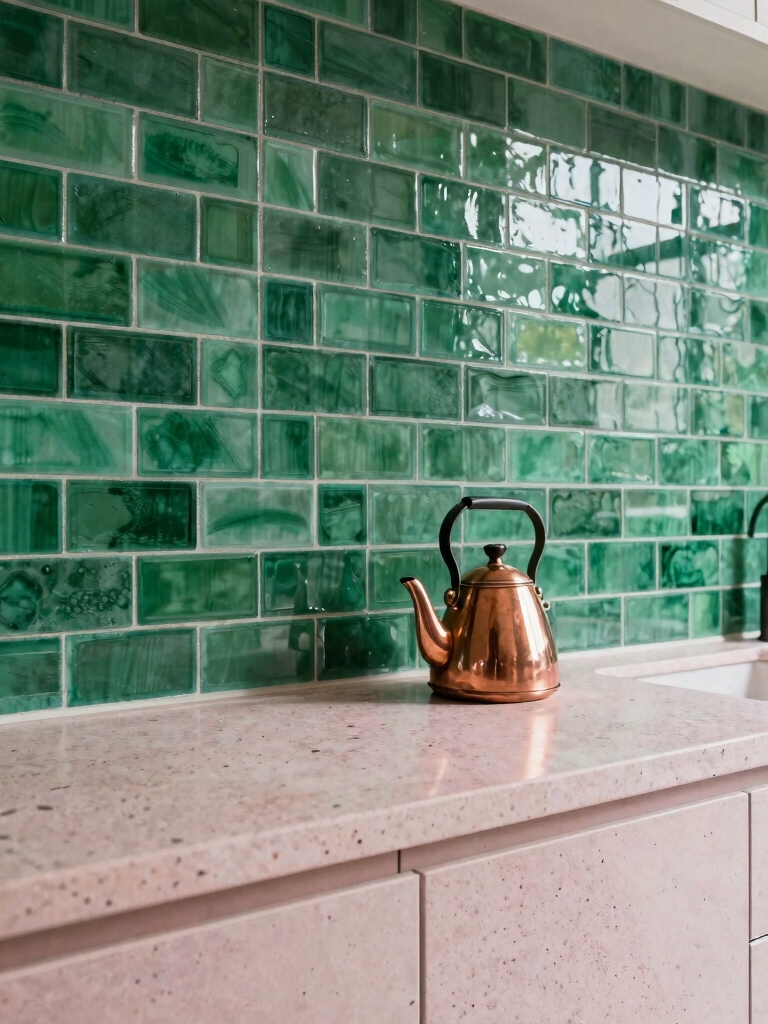
Here the green carries the drama and the pink steps back. A glossy emerald backsplash against a pale pink counter looks bold without tipping into busy, as long as you give the eye somewhere to rest.
The detail people skip is grout, and I learned it the hard way on my own backsplash. Go white or a very light gray to keep the tile crisp; a dark grout chops a saturated green into a grid and kills the glow. That one choice costs nothing extra and decides whether the backsplash looks designed or chaotic.
This pairing suits a kitchen with good light, since emerald can go cave-like in a dim room. If your space is north-facing, drop to a lighter green tile and let a green backsplash do the heavy lifting instead.
“Buy sample pots of both colors and paint a scrap board, then move it around the kitchen for a full day. Pink and green both shift hard between morning light and evening bulbs, and the pair that looked sweet at noon can turn muddy at dinner. Ten dollars of samples saves a whole repaint.”
Mint and Dusty Pink for a Retro Kitchen

Mint appliances and dusty pink cabinets pull straight from a 1950s diner, but the muted versions keep it from feeling like a costume. The trick is matching the chalkiness of both colors so neither one shouts.
Vintage-style hardware seals the era. Cup pulls and ceramic knobs cost a few dollars each and do more for the retro feel than any big purchase. I’d keep the walls plain so the two pastels stay the stars.
This look lands best in smaller kitchens, where the pastels feel cozy and warm. It is also forgiving for renters, since a mint green kitchen can be built almost entirely from removable pieces and paint you can prime over later.
Fuchsia Accents on a Bold Green Island

When you want one true showstopper, this is it. A forest green island with fuchsia bar stools is loud on purpose, and it works because you chose the clash deliberately and committed to it.
Keep the contrast deliberate
Keep the rest of the room quiet so the island can carry the energy. Secondhand stools, sanded and repainted, give you that fuchsia pop for almost nothing. Sealing a painted island with matte polyurethane keeps it tough enough for daily use.
A whole island makeover like this usually lands under $150 if you reuse the cabinet box. The cost is mostly paint, sealer, and a couple of weekend afternoons with a roller.
A few color words that come up a lot with this pairing:
📖Sage
A soft, grayed green that behaves like a neutral, which is why it pairs with almost any pink.
📖Seafoam
A pale green with a cool, slightly blue cast, best with equally soft, dusty pinks.
📖Dusty / muted
Any color with gray mixed in, so it reads calm and grown-up. The safest choice for both halves of this combo.
Terracotta Floors With Olive Cabinetry

Not every pink-green pairing has to be sweet. Terracotta floors look like a warm, dusty pink underfoot and pair beautifully with muted olive cabinets for a grounded, sun-baked feel.
This is the version of the combo that suits a more rustic or Mediterranean-leaning kitchen, where you want warmth and patina, a slower and more grown-up kind of pretty. Because the pink lives in the floor and the green in the cabinets, the two colors never crowd each other at eye level.
- Lay reclaimed terracotta tile, often a few dollars a square foot at salvage yards, for the warm clay base.
- Pair it with olive cabinets, which hide fingerprints better than almost any color.
- Add aged brass pulls you can swap in yourself in an afternoon.
Coral Shelving in a Hunter Green Kitchen

Hunter green walls can feel intense, so coral open shelving breaks up the depth and keeps the room from going dark. I love how the warmth of coral stops a deep green from feeling like a cave, all while handing you a place to show off everyday dishes that would otherwise disappear behind closed doors.
Coral sits in the same warm family as the pinks elsewhere on this list, but it has more punch, which is exactly what a deep, moody green wall can take without tipping over.
- Paint existing brackets and mount sanded reclaimed planks for about $40 total.
- Style the shelves with white or cream dishes so the coral and green stay the focus.
- Keep shelves to one wall so the green still feels like the main event.
🅰️Paint the cabinets
Biggest visual change for the money, but it is a full weekend and hard to undo. Best when you are sure of the color.
🅱️Swap stools or shelves
Lower commitment and reversible. Best for testing a bold pink before you brush it onto anything permanent.
A Mauve Range Hood in a Seafoam Kitchen

Coral warms a kitchen loudly; mauve does it in a whisper. A dusty mauve range hood against soft seafoam cabinets is the kind of pairing that looks custom but is really just spray paint and patience. This is the combo for anyone who wants pink and green without any of the noise.
- Spray-paint an existing hood in dusty mauve for around $12 in paint.
- Echo the hood with chalky pink hardware so the color feels planned, not random.
- Keep the seafoam soft and slightly grayed so the whole room stays calm.
Watermelon Stools for Playful Color

Jade green kitchens can feel a little precious, like cooking inside a jewelry box. A set of watermelon-pink stools snaps that out of it. Suddenly the room has a pulse.
Low-risk, easy to undo
Secondhand wooden stools are the move here. I tell people to leave about 20 minutes between spray coats, since rushing is what leaves drips. Sand, prime, and spray, and four of them cost about $60 total off a marketplace listing. No real skill required, just patience.
This works in any green kitchen that feels too serious. The stools are easy to swap out later, which makes them a low-risk way to test bold color before you paint anything permanent.
Pale Green Tile Edged in Raspberry Pink
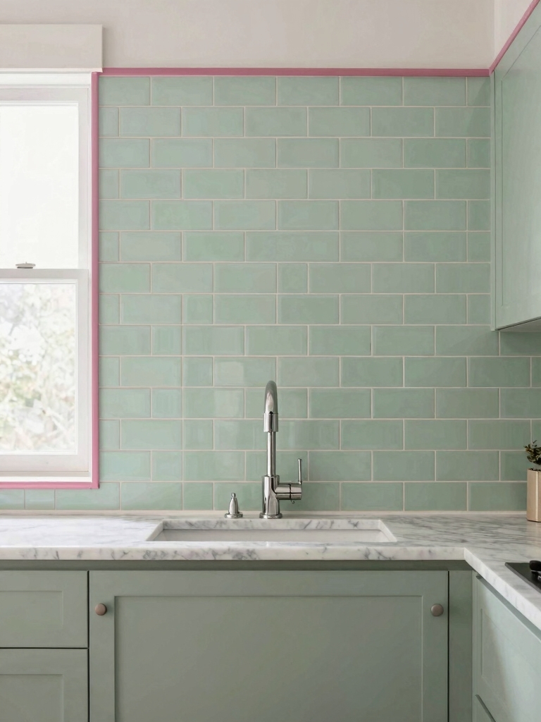
Pale green subway tile gets a real personality when you edge it with raspberry pink trim. It gives a plain backsplash that retro diner feeling without hunting down vintage fixtures. The contrast works because the green is soft and the raspberry is sharp, so the trim line draws a clean edge instead of muddying into the field tile.
You can fake the expensive version. Paint existing trim or use inexpensive PVC molding instead of a custom tile border, and the look comes together over a single weekend. The trim draws a clean line and keeps the field tile crisp. It is a small move with an outsized payoff.
- Use a glossy pale green field tile so the pink edge stays the accent.
- Keep the trim line thin so it frames the tile and lets the field stay the focus.
- Pull the raspberry into one other spot, like a dish towel, so it feels intentional.
Salmon Sink With a Moss Green Island

Warm salmon and earthy moss green sound like an odd couple. I was skeptical too. Then I saw a vintage-style salmon sink set against a moody green island, and it clicked. The warm basin keeps the deep green from feeling cold, and the green gives the salmon somewhere serious to land.
Salvage yards are your friend here. A vintage colored sink can run around $80, far less than a new statement fixture, and it brings instant character. Pair it with weathered brass faucets and a few terracotta pots to carry the warmth across the room. If you love a dark green kitchen, a salmon sink is a surprising way to soften it.
Maintenance & Care
Painted color is the heart of most of these looks, so the durability comes down to prep and topcoat. Cabinets and islands that get daily handling need a tough sealer over the color; a quality water-based polyurethane holds up to wiping and lasts years before it needs attention. Keep a small labeled jar of each paint color for touch-ups, because a chipped edge on a saturated green or pink shows fast.
For everyday care, a damp cloth and mild dish soap is enough; skip abrasive cleaners, which dull a matte finish. Expect to refresh a high-traffic island every few years, while uppers and trim can go much longer. Colored grout and tile need only the usual sealing you would give any backsplash, roughly once a year, to keep the lines clean.
Pink and Green Kitchen Questions
?Do pink and green really go together in a kitchen?
Yes, and they are easier than most bold pairings because they sit next to each other in nature. The key is using muted versions and letting one color dominate while the other appears in small accents.
?What shade of pink works best with green cabinets?
Dusty, grayed pinks like blush, mauve, and dusty rose are the most livable. They read as warm neutrals next to green, while bright bubblegum or fuchsia is better saved for a small accent like stools.
?Will a pink and green kitchen look dated quickly?
Muted versions age well, since they behave like neutrals. If you are worried about resale, keep the permanent surfaces calm and put the bolder color into swappable pieces you can change in an afternoon.
?What is the cheapest way to try pink and green?
Start with accessories or thrifted stools and shelves before painting anything. Most accent swaps cost under $60, and a single painted island or hood usually stays under $150.
Start With One Color and Let It Lead
Pink and green only go wrong when both colors shout at once. I have watched it happen. Choose which one leads, keep the other in small doses, and lean toward the dusty, muted versions of each, and the pairing turns out warmer and more grown-up than you would expect from a color combo that sounds this sweet on paper.
Pick the lowest-risk idea that excites you, whether that is a set of stools or a single painted island, and try it for a season. Color is the cheapest thing in any kitchen to change your mind about, so there is no reason not to play.
More Hair Inspiration


