
The kitchen that sold me on olive green was a north-facing galley that flattened every paint chip we taped up. Two grayed sages went dishwater under the cool light, but a warmer olive with a yellow base finally settled the room. That is the quiet rule behind olive green kitchen cabinets: match the shade to your light and the color forgives you; ignore your light and it turns muddy fast.
Olive sits between green, brown, and gray, which is why it feels grounded and easy to live with. It works like a warm neutral, pairing with brass, oak, and stone without much fuss. That is its whole appeal. Here are seventeen ways to use it, from barely-there grayed olive to deep saturated cabinets, with the trade-offs worth knowing before you commit a quart.
Olive Green at a Glance
| If you want… | Reach for | Keep in mind |
|---|---|---|
| A safe, soft look | Grayed sage-olive, brass, warm white | Behaves almost like a neutral; very forgiving |
| Drama and depth | Deep saturated olive, matte or satin | Needs good light and clean finishing |
| Low commitment | Olive on the island or lowers only | $150 to $300 DIY; easy to repaint |
Match the Olive Green to Your Kitchen’s Light

Before you fall for a swatch, look at where your windows face. Olive is yellow and green over a gray base, so the room’s light pushes it around far more than a plain white would. North-facing kitchens cool everything down and can drain a grayed olive toward gray-brown, so lean warmer and a touch more yellow.
South-facing rooms flood with warm light that can tip a yellow-heavy olive toward chartreuse by mid-afternoon, so a muted, grayed olive holds steadier. The cheapest insurance is a sample: a test quart runs about $8 to $15, and two coats brushed on poster board you can carry around the room beats trusting a chip every time. The light wins every argument.
- North light: warmer, slightly more yellow olives stay green instead of sliding gray.
- South light: grayed, muted olives resist going neon by late afternoon.
- Judge it at night too, under your real bulbs, since warm LEDs shift olive again.
Sage-Toned Olive With Warm Brass

The most requested olive in my experience is the soft, sage-leaning kind, and brass is what makes it look intentional and current. The grayed-down olive keeps the room calm, while unlacquered or satin brass on the hardware, faucet, and lighting adds the warmth that stops the green from feeling cold.
Skip high-shine polished brass if you want the quiet, earthy version. Because it behaves almost like a neutral, this pairing works in both cottage and farmhouse kitchens and cleaner modern ones.
- Start with a grayed sage-olive rather than a pure green.
- Add brass in at least three spots so it reads as a choice: pulls, faucet, one light.
- Choose satin or living brass over high-shine to keep the look warm and unfussy.
| Olive shade | Where it shines | Pairs best with |
|---|---|---|
| Grayed sage-olive | North light, small kitchens | Warm white, brass, oak |
| True yellow-olive | Bright, south-facing rooms | Cream, terracotta, black accents |
| Deep moss-olive | Well-lit rooms and islands | Pale stone, walnut, gold |
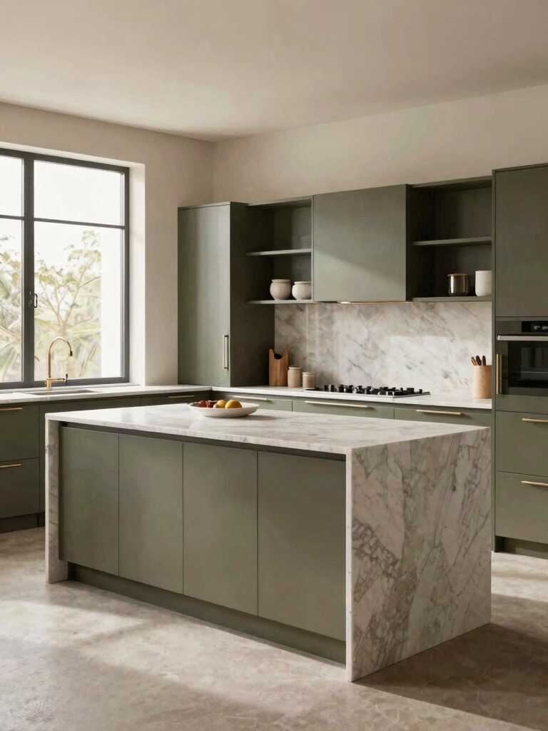
Warm Olive Cabinets Against Crisp Contrast

Warm olive can go flat when everything around it is also warm and mid-toned. The fix I make most often is a crisp contrast point: white or pale plaster walls, a honed white-and-gray stone counter, or black hardware to draw a clean line.
That contrast gives warm olive green cabinets their structure and keeps the kitchen from looking like one soft brown blur. That single clean edge does the work. Olive lowers and island under white uppers is the easiest version, and it photographs well for resale too.
- Pair warm olive lowers with white or off-white uppers to lift the room.
- Use one hard contrast, black pulls or a dark faucet, so the eye has somewhere to land.
- Keep counters on the cooler, cleaner side to balance the warmth.
Keeping a Light Olive Kitchen Airy

Light, grayed olive is the move for small or low-light kitchens where a deep green would close everything in. At roughly the value of a warm greige, a pale olive keeps walls feeling open while still giving you real color. I have watched this rescue galley kitchens and rentals that felt like beige boxes, without the cave effect people fear from green.
Keep the rest of the palette light to hold the airiness: white or cream counters, a pale backsplash, and warm wood floors kept on the lighter side. If you rent, the same color looks beautiful on a peel-and-stick or chalk-painted front for far less commitment, though painted laminate wears faster than a true factory finish.
- Pale olive with white counters keeps a small kitchen feeling open.
- Warm wood floors stop a light olive from feeling clinical.
- Renters: test the shade on one door before doing the whole run.
Five minutes of testing saves a repaint. Here is the order I use.
1Buy two test quarts
Pick one warmer and one grayer olive; chips lie under kitchen light.
2Paint big boards
Two coats on white poster board, not the wall, so you can move them.
3Watch them all day
Check each board in morning, afternoon, and night light by your cabinets.
4Hold it to your counter
Set the board against your real counter and floor before deciding.
Going Saturated for Green Kitchen Elegance

On the other end is deep, saturated olive, and this is where the earthy elegance really shows up. A rich olive close to a true moss or army green turns cabinets into the main event, especially across a full wall of them or a big island.
It takes a little confidence, but saturated olive stays more livable than navy or black because the underlying warmth keeps it from feeling severe. If you have always wanted deep color yet worried a charcoal or navy would swallow a smaller kitchen whole, a saturated olive gives you that same drama with a softer, more forgiving undertone.
Saturation rewards good finishing. Deep colors show every brush mark and smudge, so this is the place to spend on a sprayed finish or a careful two-coat job. Expect a pro cabinet spray to run roughly $50 to $100 per door depending on your area, or a patient DIY weekend with a quality enamel for a fraction of that. Give each coat about 24 hours to cure before you rehang the doors.
Balance the depth with lighter counters and plenty of warm metal or wood, or the room tips moody. A pale stone top and brass or oak open shelving give the eye relief and let the deep green do the talking.
The Fully Immersive Olive Green Kitchen

Taking olive onto uppers, lowers, and even the trim sounds bold, but a tonal, all-olive kitchen can feel like the calmest room in the house. When one color wraps the space, there is no visual chopping, and the result looks custom and quiet.
The trick is varying the finish and texture rather than the color: matte cabinets, a slightly glossier trim, a stone or zellige backsplash in a related tone. This suits rooms with decent daylight, since an immersive dark olive in a windowless kitchen can get heavy.
- Wrap one olive across cabinets and trim, then vary sheen for depth.
- Add texture (stone, tile, woven shades) so a single color keeps some life.
- Save the fully immersive look for kitchens with real natural light.
🅰️Go deep and saturated
Best in bright kitchens and on islands. Looks rich and modern, but it shows finish flaws and can feel heavy without light counters to balance it.
🅱️Keep it light and grayed
Best in small or low-light rooms. Acts like a warm neutral and stays open, though it gives you less of that dramatic, earthy punch.
Olive Green Just on the Island

Not ready to commit the whole kitchen? Put olive only on the island or the lower cabinets and keep the rest white or wood. This is the lowest-risk way in, and it is what I suggest to most first-timers because you get to see how the color lives with your light and your counters before going further. Start there if the color makes you nervous.
An olive island under white perimeter cabinets is close to foolproof and plays nicely with the two-tone trend. Repainting is cheap if you change your mind: a single island is usually a $150 to $300 DIY job in paint and a weekend, against thousands for new cabinetry.
- Olive island plus white perimeter is the easiest two-tone entry point.
- Match island hardware to your faucet finish so it looks deliberate.
- Repeat the olive somewhere small, a stool or a shade, to tie it together.
Olive and White in Easy Harmony

Olive and white is the pairing that ages best and the one most likely to please a future buyer. White uppers or white walls give olive room to breathe, and the contrast keeps even a deep olive feeling fresh and current. It is the version I recommend when resale is on someone’s mind.
Pick a warm white over a stark one
The detail that makes or breaks it is the white you choose. A stark, blue-white can make warm olive look slightly dirty, while a soft, warm white or cream sits with it far more comfortably. Carry that warm white into the counter and trim for a pulled-together look.
If you want more interest, let a green-and-white scheme borrow a third material, warm oak or aged brass, so the pairing keeps some depth. A little wood tone is usually all it needs.
Matte Olive Cabinets for Quiet Depth
Finish changes the whole personality of olive. A matte or dead-flat finish leans earthy and modern, soaking up light so the color looks deep and velvety. It also hides minor surface flaws, which is a real plus on older cabinet doors that have seen a few decades.
The honest trade-off is upkeep. Flat finishes are harder to wipe clean and can burnish where hands land most, around pulls and the sink. For a busy family kitchen I usually suggest a matte-but-scrubbable cabinet enamel rather than a true flat wall paint, so you get the look without babying it.
- Matte olive reads earthy and hides small door imperfections.
- Choose a washable cabinet-grade matte for the zones near sinks and stoves.
- Plan to touch up high-traffic edges every couple of years.
Glossy Olive Green for Reflective Drama

At the opposite extreme, a satin-to-gloss olive bounces light and feels dressier, almost lacquered. The sheen feels more formal and works beautifully in darker olives, where it adds depth and a hint of drama. It is the dressy choice. It is the finish for people who want their green to feel rich and a little glamorous.
Gloss is honest to a fault: it shows every drip, sand-through, and wall imperfection, so prep and a sprayed application matter even more here. If your doors are old or uneven, satin is the safer middle ground that still catches the light without broadcasting flaws.
Countertops and Backsplashes That Flatter Olive Green
Olive is easy on countertops because it sits with both warm and cool stone. Warm-veined marble or quartz in cream and gold flatters a sage-olive, while a cooler honed gray or soapstone grounds a deeper, saturated one. Butcher block and warm oak counters lean the room cottage; white-and-gray stone keeps it modern. The mistake I see most is matching a yellow-heavy olive to a yellow-cream counter, which leaves both looking jaundiced.
Backsplashes give olive its personality. A zellige or handmade tile in cream, white, or pale green keeps things calm, while warm terracotta or an unlacquered brass sheet pushes earthy. In a small kitchen, run the same pale tile up to the ceiling to keep the eye moving and the space open.
- Sage-olive: warm cream marble, oak, or aged brass.
- Deep olive: cooler soapstone, honed gray, or pale handmade tile.
- Skip yellow on yellow: avoid warm-cream counters under a yellow-based olive.
Common Olive Green Mistakes and Easy Fixes
Most olive kitchens that miss do so for the same handful of reasons, and nearly all are fixable before you paint. The biggest is skipping samples and trusting a chip, since olive shifts more than almost any other cabinet color from room to room.
Close behind: going too dark in a low-light kitchen, pairing it with a cold blue-white, or choosing a flat finish in a heavy-use space. None of these cost much to avoid, and all of them are costly to undo once the cabinets are sprayed.
- Test large samples on board, viewed morning, afternoon, and night.
- In low light, lighten the olive or keep it to an island.
- Pair with warm whites and washable finishes for daily durability.
Olive Green Cabinet Questions, Answered
?Do olive green cabinets make a kitchen look dark?
Only if you choose a deep olive in a low-light room. A grayed, lighter olive actually keeps a small or north-facing kitchen feeling open, especially with white counters and warm wood floors. If your kitchen is dim, lighten the shade or keep olive to the island and lower cabinets.
?What colors go best with olive green kitchen cabinets?
Warm whites and creams, brass or aged-gold metals, and natural wood like oak or walnut are the safest partners. For counters, warm marble flatters sage-olive while cooler soapstone or honed gray suits a deep olive. Avoid stark blue-whites, which can make warm olive look slightly muddy.
?Are olive green cabinets just a passing trend?
Olive behaves more like a warm neutral than a trend color, which is why it has stuck around through several green cycles. Because it sits between green, brown, and gray, it dates more slowly than a bright or jewel-toned green. Choosing a muted version over a neon one helps it last.
?How much does it cost to paint cabinets olive green?
A DIY repaint of an average kitchen runs roughly $200 to $400 in quality enamel, primer, and supplies over a weekend or two. A professional spray finish is closer to $50 to $100 per door, so a full kitchen can reach a few thousand. A single island is the budget entry at $150 to $300 DIY.
?Should I pick a matte or glossy finish for olive cabinets?
Matte looks earthy and hides door imperfections but is harder to clean, so choose a washable cabinet-grade matte near sinks and stoves. Satin or gloss feels dressier and adds depth to deep olives, but it shows every flaw and needs careful prep. Satin is the middle ground most kitchens are happiest with.
Let the Light Choose Your Olive
Olive green earns its earthy-elegant label because it behaves like a neutral while still giving you real color. Get the shade right for your light, pick a finish that matches how hard your kitchen works, and pair it with warm whites, brass, or wood, and few greens are easier to live with.
Whether you start small with an island or wrap the whole room in a deep, matte olive, the color rewards a little planning far more than a big budget. Sample first, light it the way you actually live, and let the green settle in.


