

Most people choose a grey for their kitchen and stop there, then wonder why the room feels flat. Grey on its own is a backdrop, not a palette. What turns it into something special is the second and third color you pair it with, the wood, the white, the brass, the pop of green.
Pick the right partners and grey becomes the most flexible base a kitchen can have. Pick the wrong ones and it just looks gray. Here are thirteen grey palettes that pull a modern kitchen together, with the exact pairings that make each one work and honest notes on cost.
Grey Palettes at a Glance
- Grey is a base, not a finished palette; the color you pair it with does the work.
- Warm wood and brass are the safest partners, adding the warmth grey lacks alone.
- Light grey opens a small room; dark grey adds cozy depth in a bright one.
- One pop of color against grey is the easiest way to bring the palette to life.
Why Grey Suits Modern Kitchens
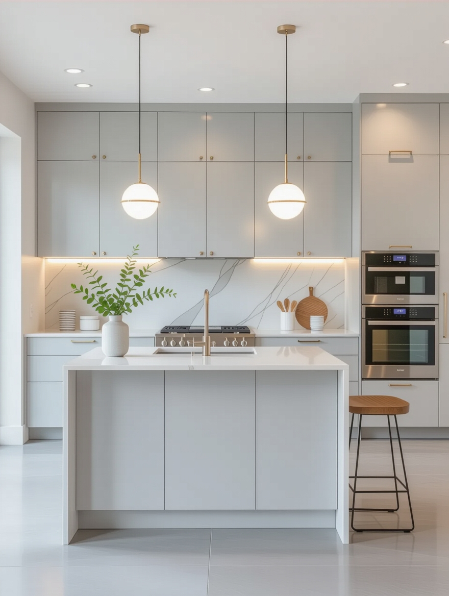
Grey works in modern kitchens because it is a chameleon. It leans contemporary against steel and concrete, classic against shaker and brass, and calm against wood, all from the same can of paint. That range is why it remains the most-used neutral after white. Few colors stretch this far. For a brighter relative, compare these modern white variations.
The one thing to settle early is how much warmth you want, since grey gives you none on its own. The palettes that follow are really just different ways to add it back.
- Grey adapts to modern, classic, or industrial depending on its partners.
- It hides everyday smudges far better than white.
- Decide your warmth source first: wood, brass, or a warm accent.
Matte vs Glossy Grey Finishes
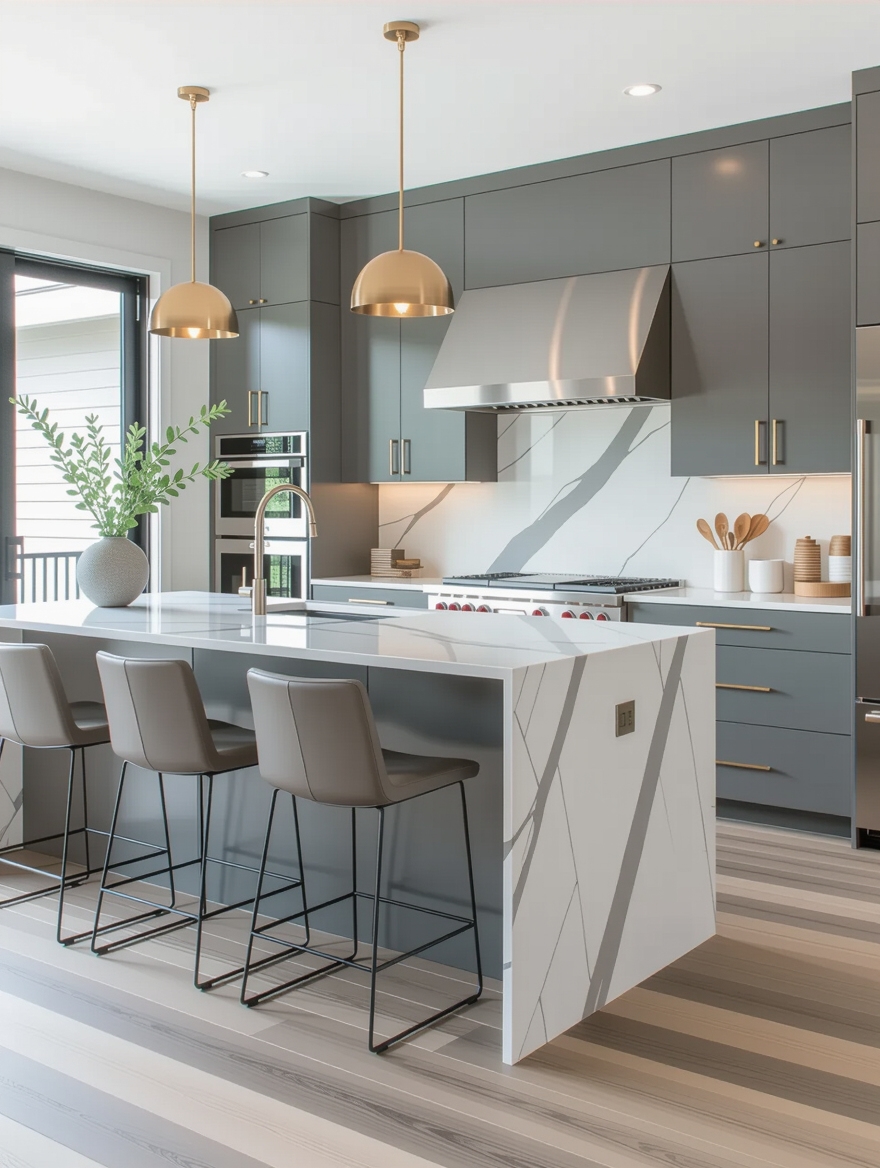
Before color, settle finish, because it changes the whole palette. Matte grey feels soft and calm, hides fingerprints, and suits a cozy room; glossy grey bounces light and brightens a dark one, but it shows every smudge.
Pick the Finish for Your Light
Most kitchens land happiest with matte on the lowers, where hands go, and the option of a little sheen up high if the room needs light.
Whichever you choose, keep it consistent across the run so the grey looks like one deliberate palette rather than a patchwork. If you are repainting to test a finish, a fresh coat dries in about an hour between passes.
👍Why Grey Is Worth It
- +The most flexible neutral after white, adapting to any style.
- +Hides everyday smudges and fingerprints well.
- +Pairs beautifully with wood, brass, and almost any accent color.
👎Where It Trips People Up
- –Feels cold with no warm element to balance it.
- –The wrong undertone can read flat or builder-grade.
- –All-grey, no-warmth schemes are the ones that date.
Soft Grey for a Calm Kitchen

A soft, pale grey paired with white and pale wood is the gentlest palette here, and the one I recommend to anyone nervous about grey. The low contrast keeps the room serene and uncluttered, and it photographs as restful rather than cold.
Best for a Restful Room
Add the warmth through pale oak and a touch of brass so the softness never tips into sterile.
This palette suits a busy household that wants calm, since the muted tones hide a lot and ask little. It pairs naturally with a warm modern feel.
Bold Charcoal Grey Statements
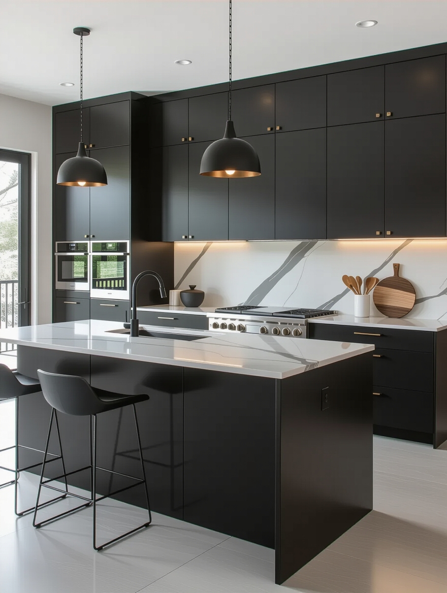
At the other end, charcoal grey is the palette for drama. Deep charcoal cabinets against a pale counter and warm wood make a confident, modern statement that feels expensive without a single bold color. The contrast is the whole appeal.
Charcoal needs light around it, so keep the counters, walls, and floor lighter, and lean on warm metals to stop the depth from feeling heavy. In a bright room, it is one of the most sophisticated palettes you can choose.
Not sure which grey palette suits your kitchen? Match it to your room.
1Your kitchen is small or dim
Go light grey with white and a reflective surface to keep it bright and open.
2Your kitchen is bright and you want drama
Go charcoal or dark grey with warm wood for cozy, confident depth.
Light Grey for Bright, Airy Spaces
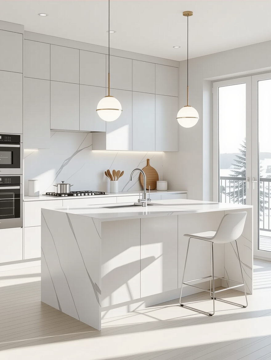
Light grey is the small-kitchen hero. Paired with white and plenty of reflective surface, it keeps a tight or dim room feeling open and bright while adding just enough color to beat plain white. It is the safe, flattering choice when square footage is short.
Keep the counters pale and the hardware simple so nothing weighs the room down. A light grey lower with a white upper is the most forgiving version of all.
Add a single warm element, a wood shelf or a brass pull, so the brightness feels inviting rather than clinical.
Dark Grey for Cozy Depth
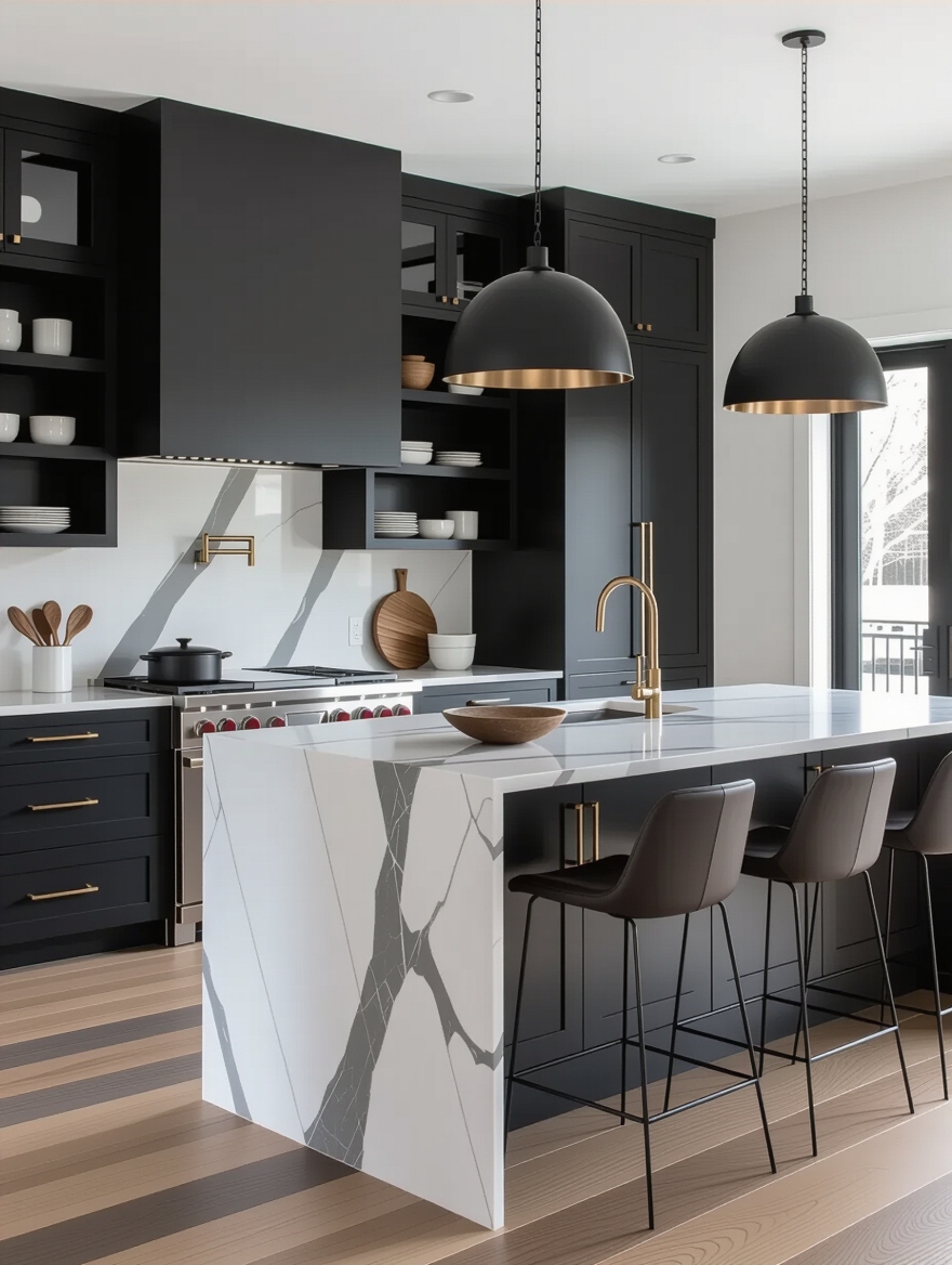
Dark grey does something light grey cannot: it wraps a room in cozy depth. In a kitchen with good natural light, deep grey cabinets feel enveloping and quietly luxurious, especially against warm wood and soft, warm lighting. It is the palette for a room you want to linger in at night.
- Reserve dark grey for rooms with real natural light, or it can feel closed in.
- Pair it with warm wood and brass so the depth stays cozy, not cold.
- Use warm bulbs and dimmers so the grey glows after dark.
Grey is never the whole answer; it is the question. The kitchen only comes together once you decide what warm thing you are pairing it with.
Grey With Warm Natural Wood
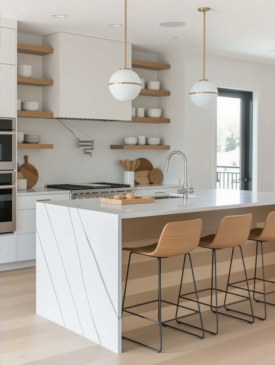
If there is one pairing that guarantees grey looks good, it is grey with warm wood. The cool neutral and the warm grain balance each other perfectly, and the wood supplies the warmth grey lacks on its own. I lean on this combination in nearly every grey kitchen I plan.
- Use wood on the island, open shelves, or the floor to warm the grey.
- Choose a warm-toned oak or walnut, not a cool gray-washed wood.
- Even one wood element shifts the whole palette from cold to inviting.
Grey Cabinets With White Counters
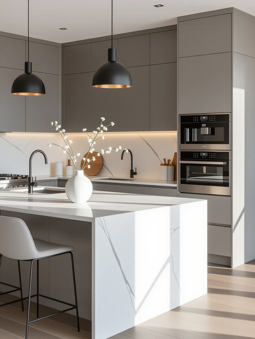
Grey cabinets under a crisp white counter is the cleanest, most classic grey palette there is. The white keeps the room bright and fresh, the grey grounds it, and the combination has stayed current for years because it never tries too hard.
A white quartz with the faintest grey veining ties the two together beautifully and saves the upkeep of marble. It is the palette that suits almost any home.
- Choose a white quartz with soft grey veining to link cabinets and counter.
- Quartz here runs roughly $55 to $115 a square foot before fabrication.
- Add warm hardware so the cool grey and white scheme has a warm anchor.
Textured Grey Tile for Depth
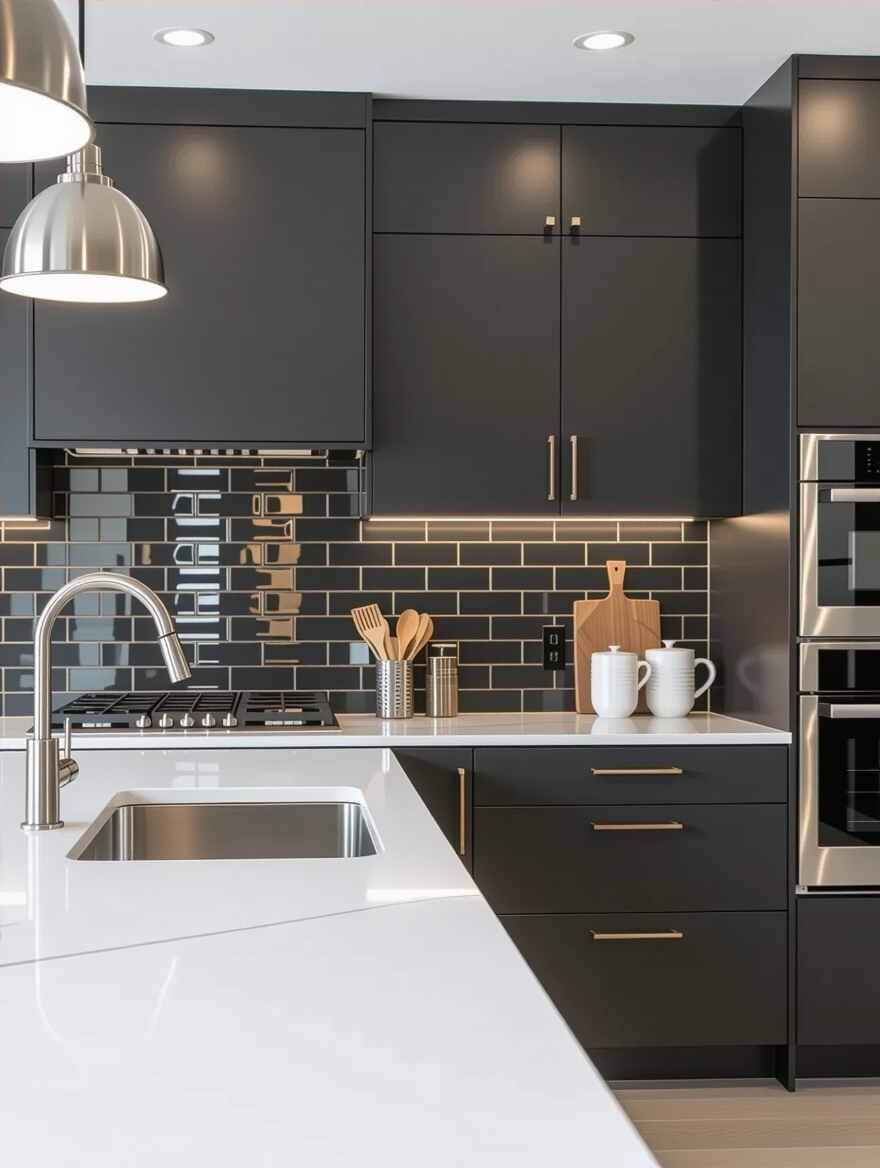
Grey can go flat, and texture is the cure. A grey backsplash with real surface interest, a zellige with its uneven glaze, a fluted stone, a stacked tile, adds depth and movement that a smooth painted wall cannot. It keeps a grey palette from feeling one-note.
Because the backsplash is small, you can afford a special grey tile here that you could never run across the whole kitchen.
- Choose a handmade or dimensional grey tile for movement.
- Keep the grout close in tone so the texture, not the lines, shows.
- One textured surface against smooth cabinets reads designed.
Grey With Pops of Color
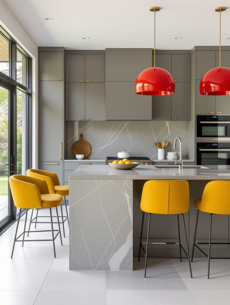
The fastest way to bring a grey palette to life is a single pop of color. Grey is the perfect quiet backdrop for one confident accent, a mustard stool, a deep green island, a row of copper pots, that gives the room energy without overwhelming it.
One Color, a Few Spots
Keep the pop to one color and a few spots so it looks intentional rather than scattered.
The beauty is flexibility: the accent can change with your mood or the season while the grey base stays put. For ideas, browse these green kitchen ideas.
Grey Appliances, Done Right
Slate and graphite appliances are a quiet way to extend a grey palette beyond the cabinets. Their soft, matte grey looks warmer and more current than bright stainless, and it blends into a grey scheme instead of interrupting it with a shiny silver box.
If you already have stainless, you do not need to replace it; just let it be the one cool metal and warm everything else with wood and brass. Matching the rest of the metals to a single warm tone does most of the work of pulling the palette together. Matched appliance finishes are what keep the palette looking pulled together.
Industrial Grey Palettes
For lofts and open plans, grey is the natural base of an industrial palette. Concrete-look grey counters, blackened metal shelving, and grey cabinets create a confident, urban scheme, with the grey tying the raw materials together so they come across as designed rather than unfinished.
Warm it up or it tips cold and hard. A wood element and a few plants are all it takes to keep an industrial grey kitchen livable, the same balance the warmer palettes rely on.
Keeping a Grey Kitchen Cozy
The one complaint people have about grey is that it can feel cold, and every fix comes down to layering warmth back in. Warm wood, brass or gold metals, soft textiles, warm-toned lighting, and a little greenery turn a cool grey room into an inviting one.
None of it is expensive, and most you can add in an afternoon. A few brass knobs, a wood board, and a warmer bulb will shift a cold grey kitchen more than you would expect, all for the price of a nice dinner out.
I tell clients to treat grey as the calm canvas and warmth as the paint. Get that balance right and a grey kitchen feels as cozy as any color. For more on the undertone side of the choice, see these gray cabinets worth pinning and a calm minimal base for the quiet side of the look.
Pair the Grey, Don’t Just Pick It
A grey kitchen succeeds or falls flat on its partners, not its shade. Whether you go soft and calm, deep and cozy, or grey with a bright pop of color, the warmth you pair in is what turns a plain gray room into a palette that pulls everything together.
So before you settle on a grey, ask yourself what warm element it will live beside, the wood, the brass, the accent. Answer that and the palette almost designs itself, and your grey kitchen will look considered instead of merely gray.
More Hair Inspiration


