
Ask most people to name a neutral and they will say white, gray, greige, maybe beige. Green almost never makes the list. Yet the muted greens, sage, olive, celadon, behave exactly like neutrals in a kitchen: they pair with everything, they recede when you want them to, and they have stayed in style for generations rather than a single trend cycle.
That is the case these nineteen kitchens make. Treated as a neutral, green gives you the calm and flexibility of beige with a depth that beige cannot touch. Below, you will see how it pairs with wood, white, brass, and black, how the shade changes the mood, and how to keep it looking fresh once it is on the walls.
Green as a Neutral, in Short
- Muted greens like sage, olive, and celadon pair with the same things beige does: wood, white, stone, and metal.
- Unlike a trend color, these greens have outlasted decades of changing kitchens, so they carry low style risk.
- The shade sets the mood. Sage calms, emerald enriches, mint freshens, olive grounds.
- Warm metal and warm wood are green’s most reliable partners, which is exactly how you would treat a beige.
The Timeless Case for Green as a Neutral

The reason green works as a neutral comes down to where it sits in nature. We are used to seeing green behind almost every other color outdoors, so the eye accepts it as a backdrop the way it works outside. That is the same job beige and gray do indoors, which is why a sage or olive kitchen feels calm and uncluttered.
Three qualities make the muted greens true neutrals:
- They are versatile. Green sits happily next to wood, white, brass, black, and stone, the whole standard kitchen palette.
- They are durable in style. Sage and olive have looked current in kitchens for decades, well past the lifespan of a trend.
- They recede on command. A muted green steps back and lets your counters and hardware lead when you want them to.
How Green Shades Shape a Kitchen’s Mood

Picking a green is really picking a mood, because the undertone does as much work as the color itself. A neutral does not have to be quiet, and green proves it by offering a different feeling at every point on the scale. Here is the quick map I use when helping someone choose.
- Emerald energizes and feels rich, the choice when you want the kitchen to have presence.
- Olive feels earthy and grounding, the most beige-like of the greens.
- Mint freshens and lifts, bright and airy in a sunny room.
- Forest and hunter add depth and coziness, best where there is good light to carry them.
Match the mood you want to the green that delivers it.
1You want the kitchen to feel calm and barely-there
Sage or celadon. They behave most like a classic neutral and recede into the background.
2You want depth and a little drama, but still timeless
Emerald or hunter in a well-lit room. Rich enough to lead, neutral enough to last.
Soft Sage, the Easiest Green Neutral

If you are nervous about color at all, start with sage. It is the green that asks the least of you and gives the most back, soothing a kitchen without draining its personality the way a flat white can. The gray-dusty undertone keeps it grounded, so it never tips into sweet or loud.
Sage earns its neutral status through its company.
- It pairs beautifully with natural wood and creamy counters for a calm, lived-with feel.
- It is the most forgiving green to paint yourself, since a mid-tone hides small brush marks.
- It works in farmhouse, modern, and traditional kitchens alike, the true test of a neutral. For more, see the sage so many people are loving.
Deep Emerald as a Rich Neutral

Emerald stretches the definition of neutral, but it earns the title in a well-lit room. The depth gives a kitchen real presence, the kind of saturated backdrop that makes brass, marble, and wood all look more expensive against it. Think of it as the little-black-dress of greens.
Keeping Emerald Calm
The key to keeping it calm is restraint everywhere else. Let the emerald be the deepest thing in the room and keep the counters, walls, and floors quiet. With a plain white counter and warm hardware, emerald sits back and lets the materials shine, exactly as a darker neutral should.
It does need light to behave. In a dim or north-facing kitchen, save emerald for an island or a single run and pour light onto it, so it stays rich instead of going black by evening.
ℹ️Good to Know
Designers have quietly treated green as a neutral for a long time. In historic homes, deep greens were standard for libraries, dining rooms, and kitchens precisely because the color flattered wood, brass, and candlelight without competing. What feels like a new trend is really a very old idea returning, which is part of why muted greens carry so little style risk.
Mint Green for a Fresh, Airy Kitchen

Mint is the brightest green that still plays neutral, and it does it by staying pale. In a sunny kitchen it reads almost like a tinted white, brightening the room and adding a clean, airy lift without the chill of true white. That is a useful trick in a space that gets cold morning light.
Pairings That Keep Mint Adult
It needs warm partners to stay grown-up. Pair mint with soft whites, natural wood, or brushed brass, and the warmth keeps it from sliding into candy territory. A little texture, woven shades or a wood counter, anchors it further.
Mint is happiest as the main event in a small or low-light kitchen, where its paleness does the work of a neutral while still giving you color. In a dark room it can go gray, so test it where it will live.
Warm, Earthy Elegance for Grounding a Room

The earthy greens, olive and moss, are the most beige-like of the bunch, and they ground a kitchen the way a warm taupe would. Their muted, slightly brown base adds depth without demanding attention, which is the whole job of a grounding neutral. Here is how to lean into that.
- Keep the partners warm: aged bronze, butcher block, terracotta, and unbleached linen all flatter an earthy green.
- Use it on the lowers to anchor the room visually, with lighter walls and uppers above.
- Let its depth do the work of hiding everyday scuffs, which makes it a smart pick for a busy family kitchen.
Heads-Up
Earthy greens like olive and moss carry a yellow-brown undertone that turns muddy under warm yellow bulbs. Before you fall for one, swap to a neutral bulb around 3000K and look at a large sample at night. The same olive that looks rich in daylight can read like split-pea soup under the wrong light, and a $5 bulb change is far cheaper than a repaint.
Olive and Natural Wood Together

Olive and natural wood is the pairing that makes the neutral argument better than any swatch could. The two share a warm, organic base, so they layer the way wood and beige do, adding texture and warmth without any clash. Put olive cabinets next to an oak counter or open wood shelving and the room feels collected and easy.
The trick is keeping the wood tones in one family so they relate. A honey oak and a cool gray-brown will fight, while a run of warm wood echoing the olive’s undertone looks deliberate. For a wider take on this shade, olive’s broader moment is worth a read.
White Counters for Crisp Contrast and Balance
If green is the new neutral, white counters are its oldest friend. A crisp white quartz or marble-look surface brightens the room, bounces light, and lets the green tones come forward, the same balancing act white does for any color cabinet. It is the safest, most resale-friendly counter choice for a green kitchen.
A few pointers keep the pairing fresh.
- Choose a warm-leaning white if your green is warm, like olive, so the two agree on undertone.
- Keep veining subtle on a marble-look so it does not compete with the cabinets.
- Carry a little white elsewhere, a backsplash or open shelving, so the counter does not float alone.
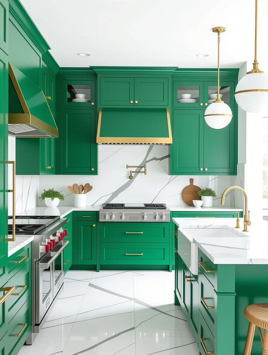
Elegant Brass Hardware to Warm Green

Brass is to green what it is to any good neutral: the warm metal that makes the whole thing feel considered. Against a cool green, brass adds a vintage warmth and a little glow that keeps the kitchen from feeling sterile. It is the single cheapest way to make green cabinets look custom.
How you handle it sets the mood and the budget.
- Unlacquered brass ages to a soft patina over months; lacquered brass stays bright and even.
- A full set of pulls runs roughly $80 to $150 in budget brass, where most of the visible payoff lives.
- Repeat the metal in the faucet or a pendant so it looks like a plan. For more, the greens that look expensive lean on brass heavily.
Black Fixtures for a Modern Edge

If brass feels too soft for you, matte black is the modern counterpart, and it treats green like a neutral in the most contemporary way. Black faucets, handles, and lighting give the green a crisp, graphic edge that suits a clean-lined kitchen. The contrast is sharp without being loud.
- Use matte black, not glossy, so the fixtures stay modern and hide water spots better.
- Keep it to two or three black elements so the room looks composed and even.
- Pair black hardware with a lighter green like sage for the freshest version of the look.
Maintenance & Care
A green kitchen stays looking like a neutral only if the finish stays clean, and the good news is that painted cabinets ask very little. Wipe spills as they happen, clean with mild soap and a soft cloth, and skip the harsh sprays and abrasive pads that dull a satin sheen. Once a week is plenty for a normal kitchen, and the soft greens hide everyday marks better than either bright white or flat black.
Two small habits protect the color over the long run. Keep deep greens out of long stretches of direct, hot sun where you can, since strong UV can slowly fade saturated pigments over years, and keep a pint of your exact color in the garage for touch-ups. Chips near handles and corners are a five-minute fix when you have the paint on hand, which stretches the years between full repaints and keeps the kitchen looking intentional.
Green as a Neutral, Answered
?Is green really a neutral, or just a popular color?
Muted greens truly function as neutrals because they pair with the full standard palette, wood, white, stone, brass, and black, and because they recede rather than dominate. Bright, saturated greens are a different story and act like accent colors. The test is the undertone: the grayer and more muted the green, the more it behaves like a neutral.
?Will green kitchen cabinets go out of style?
Sage, olive, and celadon have stayed in use for generations, so they carry about as much style risk as beige, which is to say very little. Trend-driven brights are the real gamble. And because it is paint, even a regretted shade can be changed for a few hundred dollars, which keeps the long-term risk low either way.
?What neutrals does green actually replace?
It most naturally stands in for beige, greige, and warm gray, since those are the neutrals it most resembles in behavior. Olive in particular slides right into a spot a warm taupe would fill, grounding the room. You can keep white as your counter and trim and simply let green do the job your wall or cabinet neutral used to.
?Which green is safest for resale?
Soft, muted shades like sage and olive are the widely liked, low-risk picks; they read as a considered neutral, the kind buyers respond to. If resale is a real concern, keep the green on the cabinets and the counters and walls neutral, so a future buyer sees a calm, current kitchen rather than a bold one.
Give Green the Neutral It Deserves
Once you stop filing green under bold color and start treating it the way you treat beige or gray, the whole thing gets easier. You pair it with warm wood and metal, you let the shade set the mood, you keep the partners quiet, and you end up with a kitchen that feels calm, current, and just a little more alive than another beige box. That is a neutral worth rethinking.
So before you default to greige out of habit, pull a sage or olive sample and tape it next to the beige you were about to choose. Which one still feels like a room you want to stand in?


