
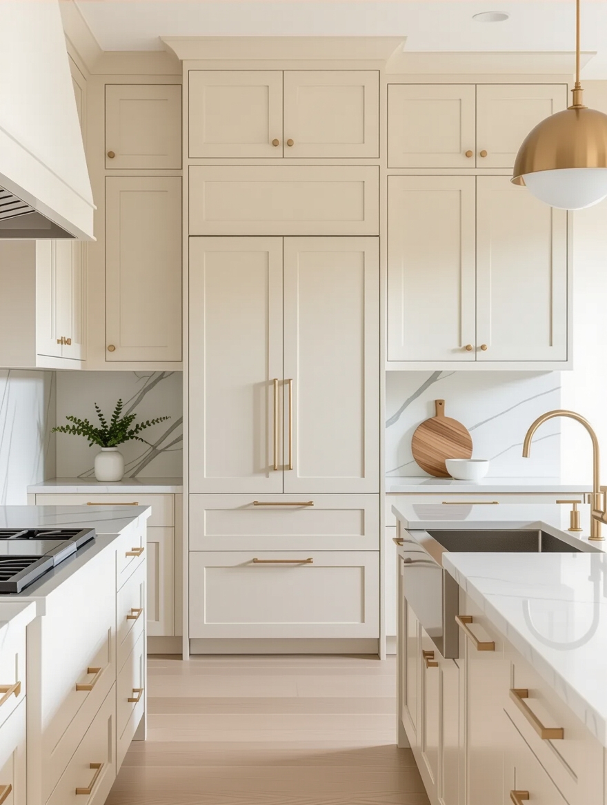
Cream is the color people reach for when white feels too cold and beige feels too heavy. It is the warm middle, soft and buttery, the shade that makes a kitchen feel candlelit even at noon. Handled well, cream is the coziest neutral there is.
Handled badly, it is the one that goes dingy. I tell everyone the same thing about it: cream lives or dies by its undertone and your light. Get a yellow-cream wrong under warm bulbs and it looks dated within a year. So these 19 cream kitchens come with honest notes on getting the shade and the light right.
Cream Shades at a Glance
| Cream shade | Undertone | Pairs best with |
|---|---|---|
| Soft buttercream | Warm yellow | Wood, brass, warm whites |
| Greige-cream | Neutral to cool | Gray, black, cooler stone |
| Antique ivory | Warm, slightly aged | Traditional kitchens, bronze |
| Crisp cream | Barely-there warm | Modern, near-white kitchens |
Choosing the Perfect Cream Shade

The shade matters more with cream than with any other neutral, because cream sits one step from both white and yellow. A touch too warm and it looks dated. A touch too cool and you have just painted off-white. The sweet spot is a soft, balanced cream that warms a room without turning it custard.
Undertone is the deciding factor. A yellow-cream glows in cool, north light but can go sallow in a sunny room, while a greige-cream stays calm and current almost anywhere, close to the gray cabinets at its cooler end. I recommend pulling samples from both the warm and cool ends and living with them for a few days.
- Test a greige-cream if your kitchen gets a lot of warm sun.
- Choose a yellow-cream to warm a cool, north-facing room.
- Always sample on the doors; never trust the paint chip.
How to land the right cream:
1Sample on the doors
Paint two coats on board and tape it to the cabinets you are matching.
2Check it all day
Cream shifts more than any neutral; watch it morning, noon, and night.
3Hold it to your fixed finishes
Compare against the counters, floor, and trim before you commit.
Bright, Inviting Cream Cabinets

Cream’s superpower is that it brightens a room while keeping it warm, which stark white cannot do. It bounces light almost as well as white but never feels clinical, so the kitchen looks open and warm and welcoming at the same time.
Bright Without the Chill
This makes cream a gift for low-light kitchens. Where white would turn gray and cold on a cloudy day, cream holds onto a soft glow, so the room stays inviting even when the sun does not show.
Pair it with warm metals and a wood floor and the warmth compounds. A cream kitchen is the one people describe as feeling like a hug, and that is no accident of the color.
Cozy Cream Cabinet Charm

If cozy is the goal, cream is the shortcut. The soft, low-contrast color wraps a kitchen in warmth, especially in a cottage, farmhouse, or traditional space where crisp white would feel too sharp.
Lean into it with layered texture: a butcher-block counter, woven baskets, linen, and aged brass. Cream is a forgiving backdrop that makes inexpensive, natural materials look richer than they are. If you ever tire of the color, a lasting cabinet repaint takes a weekend and changes everything.
- Pair cream with wood and woven texture for instant cottage warmth.
- Use aged brass or bronze hardware to deepen the cozy feel.
- Keep contrast low; cream shines in a soft, tonal palette.
Soft Cream for Minimalist Elegance
Cream is not only for cottages. On flat-front, handleless doors it turns soft and architectural, the warm answer to a cold minimalist kitchen. The clean lines keep it from looking fussy, while the cream keeps the space from feeling like a showroom. I love a cream slab kitchen with integrated handles and a single wood island. It is modern without being chilly. The choice between cream and a crisp white usually comes down to how much warmth you want.
- Use flat-front cream doors for a modern, soft-minimalist look.
- Pair with one wood element so the all-cream run does not flatten.
- Keep counters simple and let the warm color be the statement.
👍Cream over white when
- +You want warmth and a softer, cozier feel.
- +Your kitchen gets cool or low light that turns white gray.
- +You want a color that hides smudges a touch better than stark white.
👎White over cream when
- –You want the brightest, crispest, most modern look.
- –Your kitchen floods with warm light that could push cream yellow.
- –You are matching crisp white trim or appliances already in place.
Soft Cream in Coastal Kitchens

Cream is the quiet hero of the coastal kitchen. Where bright white can feel stark against a blue-and-sand palette, a soft cream looks like sun-warmed sand and ties the whole seaside scheme together.
Pair it with pale blues, natural rope and rattan, and weathered wood for a relaxed, beach-house feel. Cream keeps the look warm and welcoming, which is the difference between a coastal kitchen and a sterile one.
Warm Cream With Modern Accents

Cream takes beautifully to modern accents, which is how you keep a warm color from skewing old-fashioned. Pair it with matte-black hardware, a sleek stone counter, or stainless appliances and the cream suddenly looks deliberate and current, with none of the country fustiness.
The contrast does the work. A little black or steel against the soft cream sharpens the whole kitchen and proves a warm neutral can absolutely look contemporary. It is the easiest way to modernize a cream kitchen without losing its warmth.
Two things people get wrong about cream:
❌ Myth: Cream cabinets look dated, like old dingy white.
✅ Reality: A muddy, yellow cream under bad light earned that name. A clean, well-chosen cream with good lighting looks soft and current, not aged.
❌ Myth: Cream only works in traditional kitchens.
✅ Reality: Flat-front cream slabs are a staple of modern and Scandinavian kitchens. The door style sets the mood; the color just warms it.
Timeless Charm and Warmth

Some colors spike and fade. Cream is not one of them. Like the other soft neutrals, it has quietly outlasted decades of trends because warmth never really goes out of style.
That makes cream a safe long-term choice, the kind you will not be repainting in five years to chase a fad. It pairs with whatever counter, metal, or wall color the seasons happen to bring.
After years of watching kitchens date, the ones in soft, warm neutrals are almost always the ones that still look right. Cream ages like a classic, not a trend, which is the strongest argument for choosing it.
Cream Cabinets With Wood Accents

Cream and wood is the pairing that makes a kitchen feel collected and warm. Because cream is already a warm neutral, a wood accent adds grain and depth without fighting the color, so the room gains texture and stays soft. I steer most cream kitchens toward at least one real wood element, a butcher-block island, a run of open shelves, or a wood range hood. The contrast of grain against the smooth cream is what keeps an all-cream kitchen from going flat.
- Add a wood island or open shelves to break up an all-cream run.
- Match the wood’s warmth to the cream so they feel intentional.
- Light oak keeps it airy; walnut adds a richer, deeper contrast.
Elegant Cream and Marble

Cream and marble is the combination that looks quietly expensive. The soft cream lets the marble’s veining be the star, and the two share a warm, organic quality that feels calm rather than busy.
If real marble’s upkeep worries you, a marble-look quartz gives the same effect with none of the etching. Natural marble runs $60 to $150 a square foot installed, while a comparable quartz lands closer to $60 to $120.
- Choose a warm-white marble so it does not fight the cream.
- Pull a vein color into the hardware or stools to tie it together.
- A honed finish hides etching better than a polished one on real stone.
Elegant Contrast in Design

For all its softness, cream loves a little contrast. A dark island, a black-and-cream two-tone, or a deep backsplash gives a cream kitchen the backbone it sometimes needs so it does not feel washed out. I love a cream-and-charcoal kitchen; the warmth and the depth balance each other.
The move is to keep the contrast intentional, one strong dark element, not a scatter of competing colors. For more pairings, the cabinet colors nobody talks about show how a single contrast point lifts a neutral.
- Add one dark element, an island or backsplash, for grounding contrast.
- Try cream uppers over a charcoal or green base for a two-tone look.
- Keep the contrast to one or two notes so the cream stays the star.
Cream vs. White vs. Beige
People mix these three up constantly, so here is the honest difference. White is the brightest and crispest, modern and clean but cold in low light and quick to show every smudge. Beige is the warmest and most pigmented, a true soft neutral that leans tan. Cream sits between them: warmer and softer than white, lighter and less tan than beige.
Choose white for a bright, contemporary, high-contrast kitchen, beige for a deeply warm and cozy one, and cream when you want warmth without giving up that light, airy feel. If you cannot decide, the white cabinets and the warmer beige cabinets bracket cream on either side, and seeing all three against your own light makes the choice obvious.
Caring for Cream Cabinets
Cream shows daily life a little more than darker colors, so a light routine keeps it bright. Wipe the high-touch areas, around the handles and above the stove, with a soft, damp cloth and mild soap, then dry them so water spots do not set. A weekly pass takes a minute and stops grease from yellowing the finish over time.
Painted cream can chip at edges and pick up scuffs near the trash pull or the dishwasher. Keep a small jar of the original paint for touch-ups, and deal with marks early before they spread. Treated gently, a cream kitchen holds its soft glow for years.
Warmth Without the Chill or the Yellow
Cream is the neutral for anyone who finds white too cold and beige too heavy. It brightens like white, warms like beige, and gives a kitchen that candlelit, welcoming glow neither of the others quite manages. It all comes down to the undertone, balanced against your own light.
Sample your cream on the doors, check it morning and night, and give it one wood or one dark accent to lean on. Get the shade right and a cream kitchen is the warmest, most welcoming room in the house.


