A few years ago, recommending green cabinets to a client meant a long conversation talking them down off the ledge. Now they walk in with the swatch already pulled. Green went from the brave choice to the default sophisticated one, and designers are a big part of why, because it solves problems other colors create.
What you are looking at below is not a list of pretty green rooms. It is the specific moves pros keep reaching for: the shades they specify, the pairings they trust, and the finishes they argue about. I have flagged the reasoning behind each one, plus rough costs, so you can borrow the thinking and not just the picture.
What Designers Know About Green
The reason pros love green is flexibility. It works as a neutral with wood and white, or as a statement in emerald and forest, which means one color family covers a quiet kitchen and a dramatic one. That range is rare, and it is why green keeps showing up on project boards.
The moves below cluster around a few ideas: choose the shade by your light, warm a cool green with brass or wood, and pick the finish for how the kitchen actually gets used. Get those three right and almost any green design works.
How to Choose the Right Green

Before a designer picks a green, they look at the room, not the fan deck. The single biggest predictor of whether a green will work is the light it lives in, so that is where the choice starts. A bright, south-facing kitchen can carry a deep emerald that would turn a dim galley into a cave.
The framework most pros use is simple enough to copy.
- Assess the light first. Lots of daylight allows deep greens; low light wants pale sage or mint.
- Read the undertone. Cool, gray-based greens stay calm; warm, yellow-based greens like olive add coziness but can muddy under bad bulbs.
- Test big and on site. Tape a 12-inch sample to the cabinet and watch it morning and night before you commit. For the full breakdown, choosing green that steals the show goes deeper.
Sage: The Shade Designers Keep Specifying

If there is a single green on every designer’s shortlist, it is sage. It behaves like a neutral, flatters nearly every counter and metal, and photographs well, which matters more than people admit when a kitchen ends up on a client’s social feed. It is the green I specify when a client is nervous and wants a sure thing.
Pros lean on it for specific reasons.
- It is forgiving in any light, rarely going as muddy or as cold as bolder greens can.
- It suits farmhouse, modern, and transitional kitchens without changing the rest of the plan.
- It is the easiest green to repaint well, so a DIY client gets a result that still looks specified. See why so many people are loving sage.
🅰️Cool, gray-based green
Sage, celadon, and eucalyptus stay calm and neutral, flatter cool grays and whites, and forgive low light. The safe, modern default.
🅱️Warm, yellow-based green
Olive, moss, and avocado feel earthy and cozy and pair with wood and brass. Richer, but they can turn muddy under warm bulbs, so light them well.
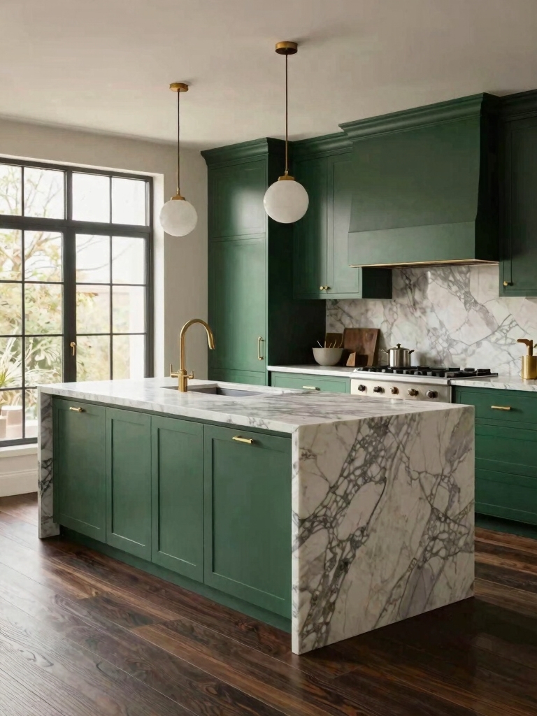
Brass Hardware on Green Cabinets

Ask a designer for the cheapest way to make green cabinets look custom and most will say the same thing: warm brass. Cool green and warm metal create a contrast the eye reads as expensive, which is why the pairing shows up in nearly every high-end green kitchen. A full set of pulls runs roughly $80 to $150 in budget brass, and the visual payoff is wildly out of proportion to that.
The pro touch is consistency. Carry the brass into the faucet or a pendant so it looks like a deliberate scheme, and decide up front between unlacquered brass, which ages to a patina over months, and lacquered, which stays bright. For more on this, the greens that look expensive lean on brass throughout.
Chic Mint Green Kitchens That Feel Fresh

Mint is having a quiet moment with designers because it solves a particular problem: how to get color into a small or low-light kitchen without making it feel heavy. Pale mint brightens a room almost like a tinted white, so it adds personality and keeps the space airy at the same time.
Why Pros Reach for Mint
The trick pros use is warmth. Left alone, mint can skew toward a 1950s diner, so they pair it with natural wood, soft whites, and brushed brass to ground it. Those warm partners pull mint into current territory and keep it from going candy-sweet.
It performs best where other greens struggle, in a galley or a north-facing kitchen, which is exactly why it earns its spot on the shortlist. In a truly dark room, though, mint can flatten to gray, so a sample test still matters.
💡Pro Tip
Designers almost never judge a green from a small paint chip under store lighting. Buy a sample pot, paint a poster board in two coats, and move it around the kitchen across a full day. Greens shift more than any other color between morning daylight, afternoon sun, and evening bulbs, and the $6 sample is the cheapest insurance against a repaint.
Versatile Forest Green Islands

The forest green island has quietly become a designer staple, and the reason is that it does two jobs at once: it adds a rich, grounding color and it gives an open-plan kitchen a clear anchor. Here is how pros keep it from feeling heavy.
- Keep the perimeter cabinets light or wood-toned so the island stays the focal point.
- Top it with butcher block or honed soapstone to keep the forest green warm and tactile.
- Light it well. A forest island in a dim room needs pendants or in-cabinet lighting so it stays rich after dark.
Matte vs. Glossy Green Cabinet Finishes

Finish is where designers actually debate, because it changes how the color behaves and how the kitchen lives. Matte and satin read calm and modern, hide fingerprints, and forgive a less-than-perfect application. They are the practical default for a family kitchen that gets touched all day.
How to Pick a Sheen
Glossy and lacquered finishes do something different. They bounce light, deepen the color, and bring a glamorous, reflective quality that can make a small kitchen feel larger. The cost is that gloss telegraphs every flaw, so it rewards a sprayed, professional application and punishes a rushed weekend.
Most pros split the difference toward satin for the bulk of the cabinets, then reserve high gloss for a single statement piece like an island. That way the kitchen stays practical where it needs to be and dramatic where it can afford to be.
- ✓Does the kitchen get heavy daily use? Lean satin for fingerprint resistance.
- ✓Is the room small or dim? A higher sheen bounces light and helps.
- ✓Are you painting it yourself? Matte and satin forgive a DIY hand; gloss does not.
- ✓Want a statement without the risk? Save high gloss for the island only.
Elegant, Calming Olive Green for Open Plans

Olive is the designer pick for open-plan kitchens that need grounding. Its muted, slightly brown base behaves like a warm neutral, so it can fill a large room with color without overwhelming the living space it flows into. It calms a big footprint the way a warm taupe would.
What makes olive work is the company it keeps. Pros pair it with aged bronze, butcher block, and unbleached linen, all warm materials that echo its undertone, while steering clear of cool gray stone that drains it. The whole palette stays in one temperature family.
It is also a workhorse for real life. Olive’s depth hides everyday scuffs and fingerprints, which makes it a quietly practical choice for the busy heart of a home where a paler color would show every mark.
Contrasting Shades of Green, Tonal and Bold

Layering two greens is an advanced move designers love because it looks collected and confident when it is done well. The key is contrast in value, pairing a light green with a deep one, so the two read as a deliberate scheme.
- Try sage uppers with a forest or hunter island for a soft-meets-deep tonal pairing.
- Keep the undertones related, all cool or all warm, so the greens feel like a family.
- Limit it to two greens plus a neutral. A third green usually tips the room into busy.
Emerald Backsplash, a Doable DIY

An emerald backsplash is the designer-looking project most homeowners can actually pull off themselves. It delivers a hit of jewel-tone color in a small, contained area, so the stakes and the cost stay low. Here is the pro approach to keeping it tasteful.
- Choose a handmade or zellige-style tile so the slight surface variation catches light and looks high-end.
- Keep the cabinets and counters quiet so the emerald can be the star of that wall.
- Budget a weekend and $10 to $25 per square foot for the tile. For more, see how a green backsplash steals the show.
Bold Dark Green in Small Kitchens

The myth designers most enjoy busting is that a small kitchen has to stay pale. I put hunter green on the lowers of a 9-by-10 galley a while back, kept the uppers white, and the room read bigger and more deliberate, not smaller. A deep green can absolutely work in a tight space, as long as you handle the light.
- Put the dark green on the lowers or one run and keep the uppers light, so the top half of the room stays bright.
- Add under-cabinet LED lighting, a $40 to $90 upgrade, so the deep color does not swallow the counter.
- Use a satin or gloss finish to bounce what light there is. For a fuller case, the bold dark-green statement makes it.
What to Expect
Borrowing a designer green move is easier than it looks, but a few honest expectations help. A quality cabinet repaint runs $200 to $600 in materials for a DIY job, or roughly $1,500 to $4,000 if you hire a pro to spray. The hardware and one good accent, brass pulls, a tile backsplash, add another hundred or two, and that is usually where the designer feel actually comes from.
Time is the other reality. A careful DIY repaint is a long weekend or two, not an afternoon, because the prep, the thin coats, and the couple of hours of cure time between each one are what separate a custom-looking finish from a streaky one. Plan for the cabinets to be out of commission for a few days, choose your shade by your light rather than a screen, and start with one element if the whole kitchen feels like too much at once.
Designer Green Kitchen Questions
?What green do designers recommend most often?
Sage leads by a wide margin, because it behaves like a neutral, flatters almost any counter and metal, and works across farmhouse, modern, and transitional styles. For clients who want more drama, designers move toward forest or emerald, but they reserve those for rooms with enough light to carry the depth.
?Is green still on trend, or is it on the way out?
Muted greens like sage and olive are less a trend than a returning classic, so they carry little risk of looking dated. The very bright, of-the-moment greens are a bigger gamble. Since cabinets are painted, even a regretted shade can be changed for a few hundred dollars, which is why pros treat green as a low-stakes choice.
?What is the most budget-friendly designer green move?
Swapping hardware to warm brass and repainting existing cabinets, rather than replacing them. For a few hundred dollars in paint and pulls, you get the look designers charge to specify. An emerald backsplash or a single painted island is the next cheapest way to get the effect.
?What finish do designers prefer for green cabinets?
Satin is the workhorse for most of the kitchen, since it hides fingerprints and forgives application. Designers reserve high gloss for a statement piece like an island, where its light-bouncing drama earns the extra care it demands. Flat matte looks beautiful but shows smudges near handles.
?Can I mix green with other colors, or keep it all green?
Both work. The safest designer approach is green plus warm neutrals, wood, white, brass, which lets the green lead. If you want more energy, a tonal pairing of two greens or a green-and-black combination both look intentional, as long as you keep the palette disciplined and let one element dominate.
Borrow the Thinking, Not Just the Look
The reason designers keep returning to green is not that it is trendy. It is that the color is unusually willing to do whatever a kitchen needs, quiet neutral or rich statement, modern or classic, depending on the shade and the company you give it. Once you see green as a flexible tool instead of a bold gamble, every one of these twenty designs gets easier to pull off.
Pick the move that fits your kitchen and your light, start with the one element that would change the room the most, and let the rest follow. If you could only borrow one of these ideas this season, which would it be?


