

The kitchens that rack up a million pins are almost never the most expensive ones. They are the ones with a clear point of view: one strong color, one honest material, one detail you remember after you scroll past. People save those because they can picture them in their own homes.
I pulled together the styles that keep showing up on those boards and sorted them by what actually works in a real kitchen, not just a styled photo. Some are budget-friendly weekend swaps. A few are real renovations. I will flag which is which, and tell you who each look truly suits.
Quick Answers Before You Pin
What makes a kitchen design ‘pin-worthy’? A single clear idea, not ten. One bold color, one warm material, and clean styling beat a room trying to do everything at once.
Which of these is cheapest to copy? Two-tone cabinets and a bold backsplash. Both transform a kitchen with paint or tile for a few hundred dollars and a weekend.
What lasts longest once the trend cools? Classic white, natural wood, and real-stone counters. They photograph well now and still look right in ten years.
Sleek Modern Kitchens With Minimalist Flair

Minimalist kitchens pin well because the photos are calm, and calm sells. The look leans on flat-front cabinets, hidden hardware, and surfaces kept almost bare, so the eye has nowhere to snag. It suits people who like to cook clean and put things away, and it punishes anyone who lives in a pile of mail. I push clients toward this only when they are honest about their habits, because the style shows every stray object.
- Flat-panel (slab) doors with push-to-open or thin edge pulls for a clean face
- A tight palette: two neutrals, one accent, and matte over glossy finishes
- Integrated appliances and a deep drawer to hide the toaster and the clutter
Cozy Farmhouse With Warm Wood and Vintage Lighting

Farmhouse stays at the top of the pin charts because it feels like a hug. Warm wood, an apron sink, and a pair of aged-brass pendants give a new kitchen the soul of an old one. The vintage lighting is the detail people actually save, so spend there if you spend anywhere. It suits busy family kitchens, since the worn-in look forgives fingerprints and a little mess.
- Two vintage-style pendants over the island for that signature warm glow
- Reclaimed wood shelves or a butcher block run for honest texture
- Pair with other farmhouse kitchen details for a look that holds together
ℹ️Good to Know
Vintage-style lighting is the single detail people pin most in farmhouse kitchens. If your budget is tight, put it into two good pendants over the island; they change the room more than new cabinet doors would.
Vintage and Retro Color Palettes

Retro kitchens are having a real moment, and the pins lean hard on color: mint green, buttery yellow, cherry red. These shades carry instant personality and pair with chrome details and rounded, old-school appliance shapes. The look is joyful, which is exactly why it spreads.
My honest caution is to commit the color to things you can change. A retro cabinet color is a delight until you tire of it, so I steer people toward bold paint and swappable accessories over a $3,000 colored range they will regret. Keep the big-ticket pieces neutral and let the cheap stuff carry the era.
- Bring the color through cabinet paint, bar stools, and small appliances
- Keep counters and floors neutral so the palette has room to pop
- Add one true vintage find, a clock or a breadbox, for an authentic note
Classic White Kitchens With Timeless Appeal
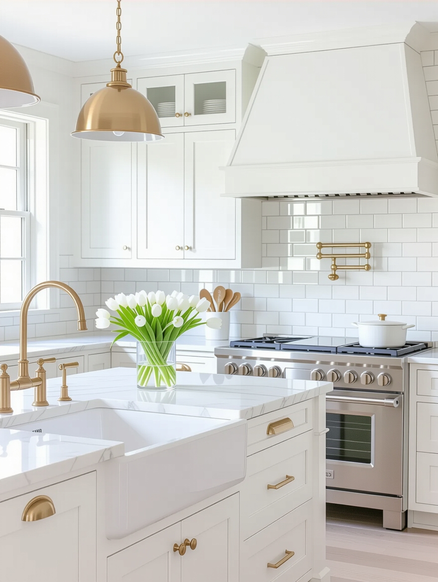
White is the most-pinned kitchen color for a reason that has nothing to do with trends: it works everywhere and dates slowly. A white kitchen bounces light, feels larger, and takes any accent you throw at it later. It is the safe foundation that a timeless kitchen approach is built on.
- Pick a warm white with a soft undertone so it never goes hospital-cold
- Add warmth back through wood, brass, or a stone counter with movement
- Vary the texture, like a handmade tile, so all that white still has depth
👍Why white kitchens stay on top
- +Reflects light and makes small kitchens feel bigger
- +Takes any accent color you add later, no repaint needed
- +Dates slowly, so the bones outlast the trend cycle
👎Where they ask more of you
- –Shows splatter and needs wiping more than a mid-tone
- –Can feel cold without wood, brass, or texture added back
- –Pure bright white can feel clinical under cool bulbs
Bold Black Kitchens That Impress

Black kitchens are the dramatic cousin of white, and they photograph like a magazine cover. Matte black cabinets with simple hardware look sophisticated and modern, and the darkness hides smudges better than you would expect. It is a confident choice that rewards good lighting.
The trap is a black hole, so I always balance the dark with warmth and light. Wood open shelves, brass fixtures, and plenty of under-cabinet lighting keep the room from swallowing itself. Black suits larger or sunny kitchens best, where there is enough daylight to give the depth somewhere to breathe.
- Choose matte or satin black, since high gloss shows every fingerprint
- Layer in wood and brass so the room feels warm, not heavy
- Add strong task lighting, because dark surfaces eat a lot of light
Two-Tone Cabinet Combinations

Two-tone cabinets give you the most visual payoff for the least money, which is why they fill so many boards. Painting the lowers a deep color and keeping the uppers light grounds the room and makes the ceiling feel taller. The question I get again and again is which color goes where, so here is the order that works.
- Put the darker, bolder color on the base cabinets and the island
- Keep uppers light or white to hold the airy, open feeling up high
- Tie the two together with one hardware finish so the split looks planned
- Test paint on a door in real daylight before you commit the whole run
How to plan a two-tone cabinet split that looks intentional:
1Anchor the bottom
Choose a deeper color for base cabinets and the island to ground the room.
2Lift the top
Keep uppers light or white so the upper half of the kitchen stays airy.
3Unify the metal
Use one hardware finish across both tones so the split looks designed, not unfinished.
Bold Kitchen Backdrops That Make a Statement
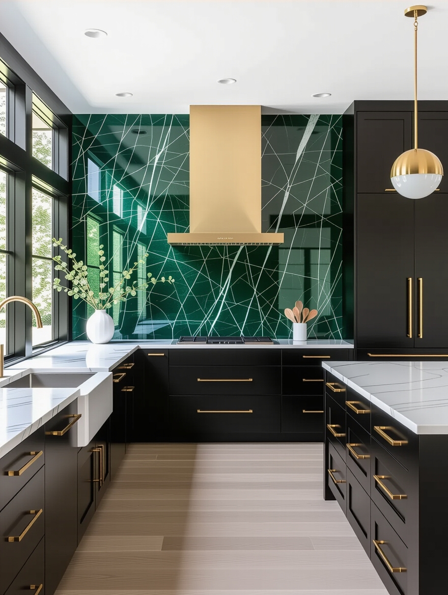
When a single feature gets a kitchen pinned, it is usually the backsplash. It sits at eye level, covers a contained area, and changes the entire mood for a few hundred dollars. A run of oversized stone, a hand-glazed tile, or a graphic pattern turns a plain wall into the thing people remember.
The rule that keeps a bold backsplash from going wrong is to let it lead and keep everything else quiet. Pull your cabinet and counter colors from the tile, then stop adding. A loud backsplash in a loud room just becomes noise, and the photo loses its focal point.
Budget around $15 to $50 per square foot for a statement tile, more for slab. Running it to the ceiling behind the range gives the most dramatic, built-in result for the money.
Mixing Metals for Modern Style
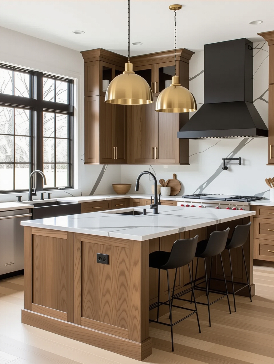
Mixing metals signals a designed kitchen, and the pins prove people have moved past matching everything. The depth comes from contrast: a warm brass faucet against matte black hardware, or polished nickel beside an aged-bronze pendant. Two finishes give a room richness that one uniform metal cannot.
Pick a Lead, Let One Support
The way to keep it from looking accidental is a clear hierarchy. Pick one metal to dominate the big visible pieces, the faucet and the lighting, and let a second play support on the hardware. I tell clients to stop at two finishes, since a third usually tips the balance into chaos.
This costs nothing extra if you plan it before you buy. You are choosing finishes you needed anyway, just with intention instead of defaulting to all-chrome.
Natural Wood to Warm Up the Kitchen

Every all-white or all-stone kitchen on those boards eventually needs rescuing from cold, and natural wood is how the best ones do it. A wood island, open shelving, or a single run of wood-fronted cabinets brings grain and warmth that paint cannot fake. The contrast is what gives the room life.
You do not need a full wood kitchen to get the effect, and that is the budget-friendly part. One walnut shelf or a butcher block on the island goes a long way, and the principles behind a designer’s best material mixes apply straight across. Let the wood be the warm note against your cooler surfaces.
- A butcher block island top for warmth you can actually prep on
- One floating walnut or white-oak shelf to break up painted cabinets
- Wood stools or a wood table to carry the tone into the eating area
Durable Countertops Worth the Investment
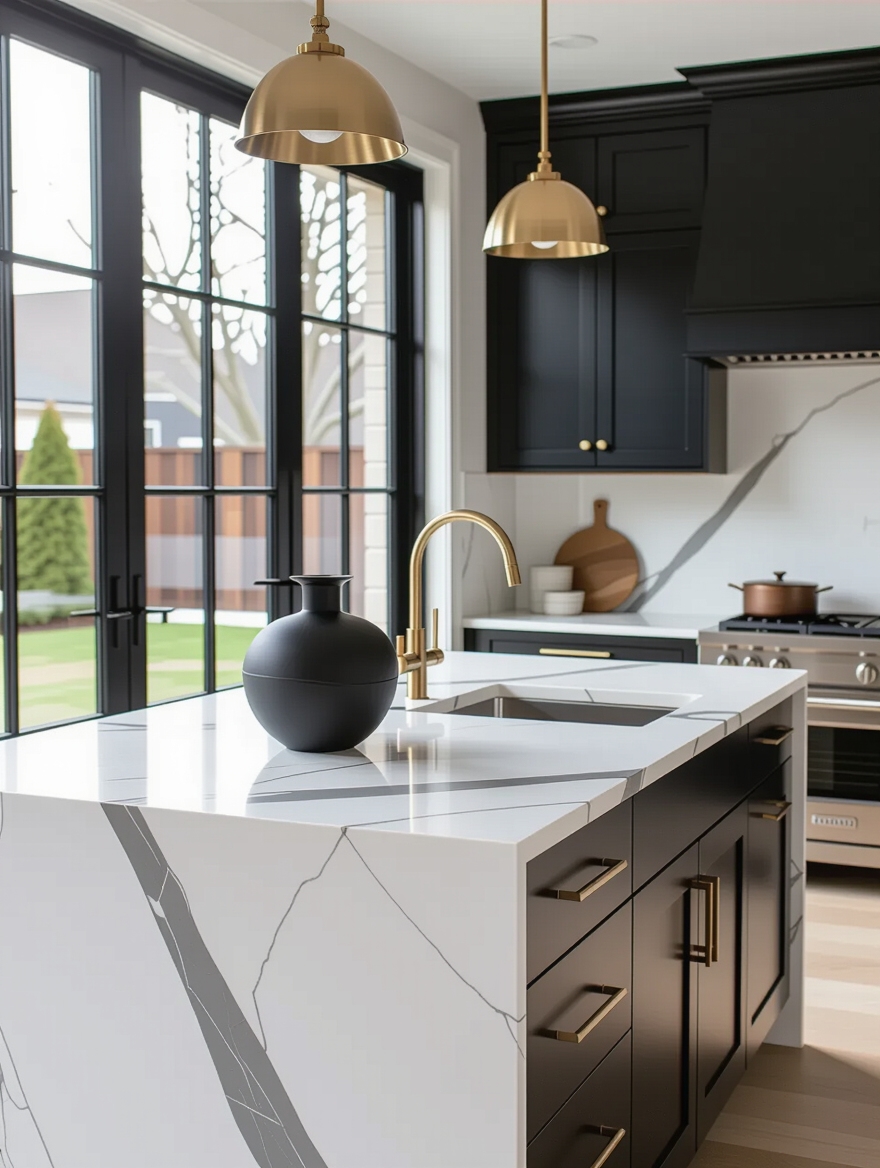
Counters anchor most of these pinned kitchens, and the two that show up most are marble and quartz. Marble brings that soft, veined drama people fall for, with the honest cost of sealing and the risk of an etch from a lemon. Quartz copies the look in a tougher, non-porous surface that asks for almost nothing.
I have installed enough of both to give simple advice. If you cook hard or live with kids, quartz will keep you happier and runs about $50 to $100 per square foot. If you treat marks as character and want the real thing, natural marble rewards you, as long as you can live with patina.
Whichever you choose, splurge on the counters before the decor, since this is the surface your hands and eyes meet every single day.
Which Direction Fits Your Kitchen
A board full of pins is fun until you have to pick, so match the style to your real kitchen and your real habits. Sunny and spacious can carry a dramatic black or a bold backsplash. Small and dim wants light cabinets, a mirror-bright finish, and a single pop of color instead of an all-over commitment. Renters should chase the cheap, reversible wins: paint, hardware, lighting, and styling.
Above all, pick one idea and let it lead. The kitchens that get saved a million times are not the ones with every trend stacked together; they are the ones with a clear direction and the discipline to stop there. For more layout-driven inspiration, an island-focused design and a never-dated approach are good next stops.
Pin Many, Build One
These styles earn their million pins by being clear, not by being complicated. Sleek minimalism, cozy farmhouse, dramatic black, classic white: each one says something the moment you walk in, and that single strong idea is what makes a kitchen memorable in a photo and in person.
Save as many as you like, then choose the one that fits your light, your space, and the way you actually cook. Build that one well, resist the urge to fold in three others, and you will end up with the kind of kitchen other people pin.
More Hair Ideas


