
Two kitchens can have the exact same open shelves and look worlds apart in price. One looks like a cluttered afterthought, crammed with mismatched mugs and plastic. The other looks like it cost a fortune, even when it did not. The difference is never really the budget. It is a handful of tricks that signal money: quality materials, a tight palette, real restraint, and a little negative space.
Open shelving is one of the cheapest ways to change a kitchen, but only if it looks intentional. Done carelessly, it cheapens the room. Done with these moves, your open shelf kitchen can look high-end on a modest budget. Below are the arrangements that look expensive, from the shelves themselves to exactly what goes on them.
Cheap Look vs Expensive Look
| Looks cheap | Looks expensive |
|---|---|
| Cluttered, crammed shelves | Edited, with breathing room |
| Mismatched, random pieces | Cohesive, monochrome groupings |
| Thin shelves, cheap white brackets | Thick wood or stone, quality brackets |
| Plastic and novelty items | Glass, ceramic, wood, and brass |
How Open Shelving Transforms a Kitchen

Open shelving is the rare upgrade that can make a kitchen look more expensive while costing less than cabinets. Swapping a run of upper cabinets for a few well-styled shelves opens the wall, shows off pretty pieces, and gives the kitchen a curated, boutique feel. The catch is that open shelves are unforgiving. Done right, they look custom and high-end.
Done wrong, they look like clutter on display. The whole game is making the shelves look deliberate, with quality materials, a tight edit, and styling that signals care rather than cost. Get that balance and a budget kitchen punches well above its price, the same trick behind any open shelving display that pops.
- Open shelving costs less than cabinets but can look more expensive.
- The luxe look comes from quality materials and a tight edit.
- Careless shelves look like clutter, so styling is everything.
Plan the Shelving Layout for Style

Before styling, the placement and proportion of the shelves decide whether they look custom or cheap. Expensive-looking shelving usually means fewer, longer, well-spaced shelves rather than a crowded grid of little ones. Float a couple of substantial shelves on a feature wall. Give them generous space above and below, and they look like an architectural choice.
Center them over a sink, a range, or a run of counter so they look planned and centered. Keep the depth practical, around 10 to 12 inches, so plates fit, and align the shelves with something, a window, the counter, the cabinets, so the whole arrangement feels considered. Proportion is quiet, but it is one of the biggest tells between a high-end look and a builder-basic one.
- Choose fewer, longer shelves over a crowded grid of small ones.
- Give each shelf generous breathing room above and below.
- Align the shelves with a window, counter, or cabinet line.
What is making your shelves look cheap?
🎯They are crammed full
Edit hard; negative space is the number-one expensive-look signal.
🎯The pieces clash
Switch to a tight, monochrome palette so it reads as collected.
🎯The shelves look flimsy
Upgrade to thicker wood or stone with quality brackets.
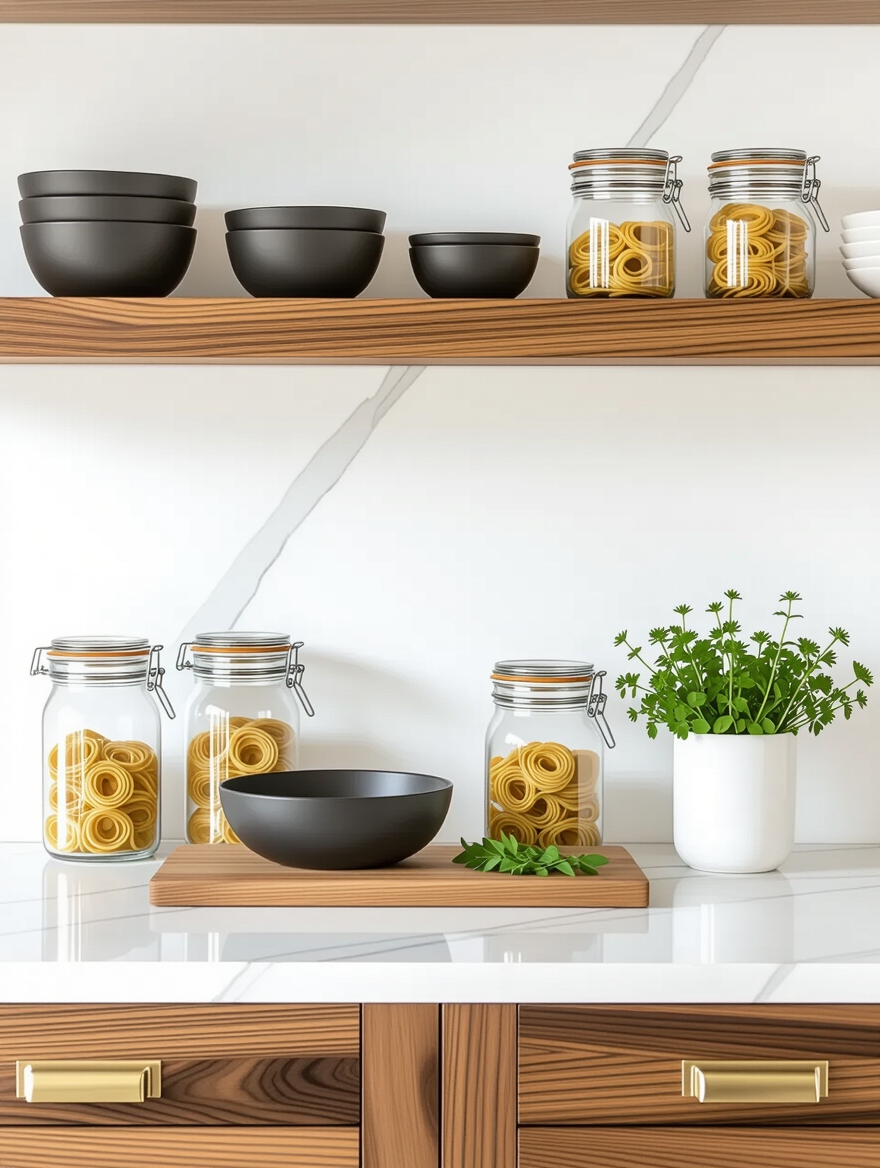
Materials That Look Expensive

Nothing signals money on open shelves faster than the material of the shelf itself. Thin, hollow, or obviously cheap shelving undercuts even beautiful styling. A substantial shelf instantly looks high-end. Go for solid thick wood at least an inch and a quarter deep, a stone or marble shelf for real luxury, or wood with a rich finish.
A substantial shelf is the first luxe signal
The brackets matter just as much, and they are where cheap shelves give themselves away. Skip flimsy white L-brackets. Choose brass, blackened steel, or leather straps, or hide the supports entirely for a floating look. Quality brackets in a warm metal look like a deliberate, expensive detail.
You do not have to spend a fortune. A thick wood shelf with brass brackets can be a few hours of weekend work for $60 to $150, far less than cabinetry, yet it photographs as custom. I recommend spending on the shelf and brackets, since those are what the eye registers as quality.
Mix Wood and Metal for a High-End Look

The wood-and-metal combination is a shortcut to the expensive look, because it mirrors how high-end kitchens layer materials. Warm wood shelves with brass or matte-black brackets, a metal rail, or metal accents in the styling create the contrast designers rely on. The trick is restraint and repetition. Pick one wood tone and one metal, then repeat each two or three times across the arrangement so it looks intentional.
A walnut shelf, brass brackets, and a brass-rimmed canister look like a designed scheme. Mismatched metals and clashing woods look accidental. Let the wood bring warmth and the metal bring a crisp, polished edge, and the shelves get the layered, considered look that signals real money, the same logic behind a shelf decor formula that works.
- Pair one wood tone with one metal and repeat each a few times.
- Choose brass or matte-black brackets over plastic or white ones.
- Let wood add warmth and metal add a crisp, polished edge.
🅰️Thin shelf, white bracket
Cheap and easy, but it looks builder-grade and flimsy no matter how nicely you style it. The eye clocks the thin edge and plastic-looking support instantly.
🅱️Thick wood, brass bracket
Looks custom and expensive even on a budget. The substantial edge and warm-metal support signal quality before you add a single dish.
Neutral Tones for a Chic, Calm Look

If one styling rule makes shelves look expensive, it is a tight, tight neutral palette. Cohesive whites, creams, woods, and a little black or brass look calm and curated. A jumble of bright colors and patterns looks busy and cheap, no matter the quality of the pieces. Expensive-looking kitchens almost always limit the shelf palette to two or three quiet tones.
Monochrome is the most reliable luxe trick. A shelf of all-white ceramic with wood and one metal accent looks instantly high-end, because the restraint signals confidence. If your dishes are a colorful mix, pull the cohesive neutral pieces to the open shelves and hide the rest behind doors. The fewer colors compete, the more expensive the whole arrangement looks.
- Limit the shelf palette to two or three quiet, neutral tones.
- Lean on white, cream, wood, and one metal for a curated look.
- Hide colorful, mismatched pieces and display the cohesive ones.
Curate Stylish Open Shelf Decor
The single biggest expensive-look secret is restraint: show fewer, better things with room around them. A few well-chosen pieces, a stack of beautiful plates, a single sculptural vase, a wood board, look far more expensive than a shelf crammed with stuff, however nice. Negative space is the luxury, and it costs nothing.
Negative space is the real luxury
Curate like a boutique. Edit down to your prettiest pieces, group them with intention, and leave deliberate gaps so each object can breathe. One striking item, a marble bowl, a brass pitcher, an art piece, does more for the expensive look than five ordinary ones. The eye takes a sparse, considered shelf as high-end and a packed one as cluttered.
When in doubt, take something off. I tell clients most shelves that look cheap are simply overfilled, and editing is free. A shelf that is about two-thirds full, with clear space around each grouping, is the fastest way to make open shelving look like it belongs in a design magazine.
| Element | Cheap look | Expensive look |
|---|---|---|
| Colors | Many bright, clashing | Two or three quiet neutrals |
| Dishes | Mismatched sets | One cohesive set |
| Accents | Random novelty | Brass, marble, glass |
Layer Textures for Depth

Once the palette is tight, texture is what keeps an expensive-looking shelf from feeling flat. A monochrome shelf of all-smooth white can look lifeless. The same palette with mixed textures, smooth glaze against rough stoneware, a woven basket, raw wood, a bit of marble or glass, gains the depth that signals quality.
Vary the finishes so light plays across the shelf. Matte beside glossy, rough beside polished, hard beside soft. A chalky ceramic next to a shiny brass canister and a nubby linen does more for the high-end look than any bold color. Expensive design is about material richness.
This is the trick that makes a neutral, restrained shelf look costly. The textures do the work the color is not doing, giving the arrangement a layered, gathered-over-time feel that signals money and taste.
Greenery to Enhance the Kitchen

A little greenery is the finishing touch that makes shelves look polished, the way a fresh arrangement does in a hotel lobby. One trailing plant, a small potted herb, or a few stems in a beautiful vase brings life and a hit of organic softness to all that ceramic and metal. The key is one, maybe two. Not a jungle.
Keep the greenery as curated as everything else. Choose a pretty pot in your palette, a brass planter, a stone pot, a simple ceramic, since a plastic nursery pot undoes the whole effect. I love a single trailing vine spilling over a shelf edge, or one good stem in a glass bottle, which reads as quiet luxury. Even a high-quality faux plant works where real ones struggle in a dark kitchen.
Elegant Glassware Arrangement

Glassware is the secret weapon of expensive-looking shelves, because glass catches light and adds sparkle the way crystal does in a fine restaurant. A row of matching glasses, a few stemmed pieces, or a cluster of clear and amber bottles looks refined, especially when the light hits them. Lining glassware up by type and height creates the kind of order that signals care.
Let the light catch the glass
Group it thoughtfully. Keep the everyday glasses tidy and lower, and reserve a styled upper shelf for the prettiest stemware, decanters, and colored glass. Matching or coordinated glassware always looks more expensive than a random mix, so edit out the freebies and novelty cups.
For real impact, add a small light. A puck light or an LED strip tucked under a shelf makes glassware glow and gives the whole arrangement a high-end, lit-display feel, the kind of touch that turns open shelves into a feature, much like a styling rule worth stealing.
Smart Storage That Hides the Clutter

The final expensive-look secret is what you do not show. Nothing cheapens open shelves faster than the everyday clutter, the cereal boxes, the plastic tubs, the mismatched gear, so the luxe look depends on hiding all of it behind closed doors. Balance every run of open shelving with enough closed cabinets to swallow the unphotogenic stuff.
Keep only the pretty and the quality on display, and give everything else a closed home. The fewer ordinary items the eye sees, the more expensive the whole kitchen looks, since high-end spaces show only the curated and conceal the practical. A tidy, edited open shelf above a wall of hidden storage is the arrangement that looks truly expensive, the same discipline behind a wow-worthy open shelving idea and any clutter-free open shelf.
Expensive-Look Open Shelf Questions, Answered
?How do I make open shelves look more expensive?
Edit hard and upgrade the materials. Show fewer, cohesive pieces in a tight neutral palette with real gaps between them, and swap thin shelves and white brackets for thick wood or stone with brass or black supports. Mix textures, add one plant and some glassware, and hide all the everyday clutter behind closed doors. Restraint and good materials do almost all the work.
?What makes open shelving look cheap?
Clutter and mismatched, low-quality pieces. Crammed shelves, clashing colors, plastic items, thin shelves, and flimsy white brackets all look cheap no matter the kitchen. The fix is to edit down to cohesive, quality pieces, leave breathing room, and upgrade the shelf and brackets to something substantial.
?What should I put on open shelves to look high-end?
Cohesive dishware in neutral tones, a few quality pieces like a marble bowl, a brass canister, or a wood board, elegant glassware, one plant in a nice pot, and a single sculptural object. Keep colors tight, textures varied, and the shelf no more than two-thirds full. Hide anything plastic, novelty, or mismatched.
?Are open shelves cheaper than cabinets?
Yes, usually much cheaper, which is part of their appeal. A few wood shelves and brackets cost a fraction of upper cabinets, often $60 to $150 per shelf for a quality DIY version. The savings only pay off in looks if you style them well, since careless open shelves can make a kitchen look cheaper rather than more expensive.
Expensive Is Mostly Restraint
Here is the freeing truth about making open shelves look expensive: it has almost nothing to do with how much you spend. The signals of money, a substantial shelf, quality brackets, a tight neutral palette, mixed texture, real negative space, and the discipline to hide the clutter, are mostly about restraint and a few smart material choices. A thoughtfully styled budget shelf beats an expensive one that is crammed and chaotic every time.
If your open shelves are not giving you that high-end feeling, try the cheapest fix first: take everything off, then put back only your prettiest, most cohesive pieces, with real gaps between them. That single edit, less stuff, tighter palette, more space, does more for the expensive look than any purchase. Add a thicker shelf, a brass bracket, or a small light later, and a modest kitchen starts to look like it cost a great deal more.


